For as long as I can remember “WP” was short for “Waypoint”. I think it would be universal and understandable to everyone (also non-english users - e.g. like me). Both “Point” and even more “#” could be confusing what they refer to… That’s my three cents.
I don’t mean to be rude, but in all seriousness I wonder: why should we change this at all? Just so that a person does not have to rename the default waypoints (without names)? Strange …
Such a request would not even be answered at Garmin or TomTom, I think.
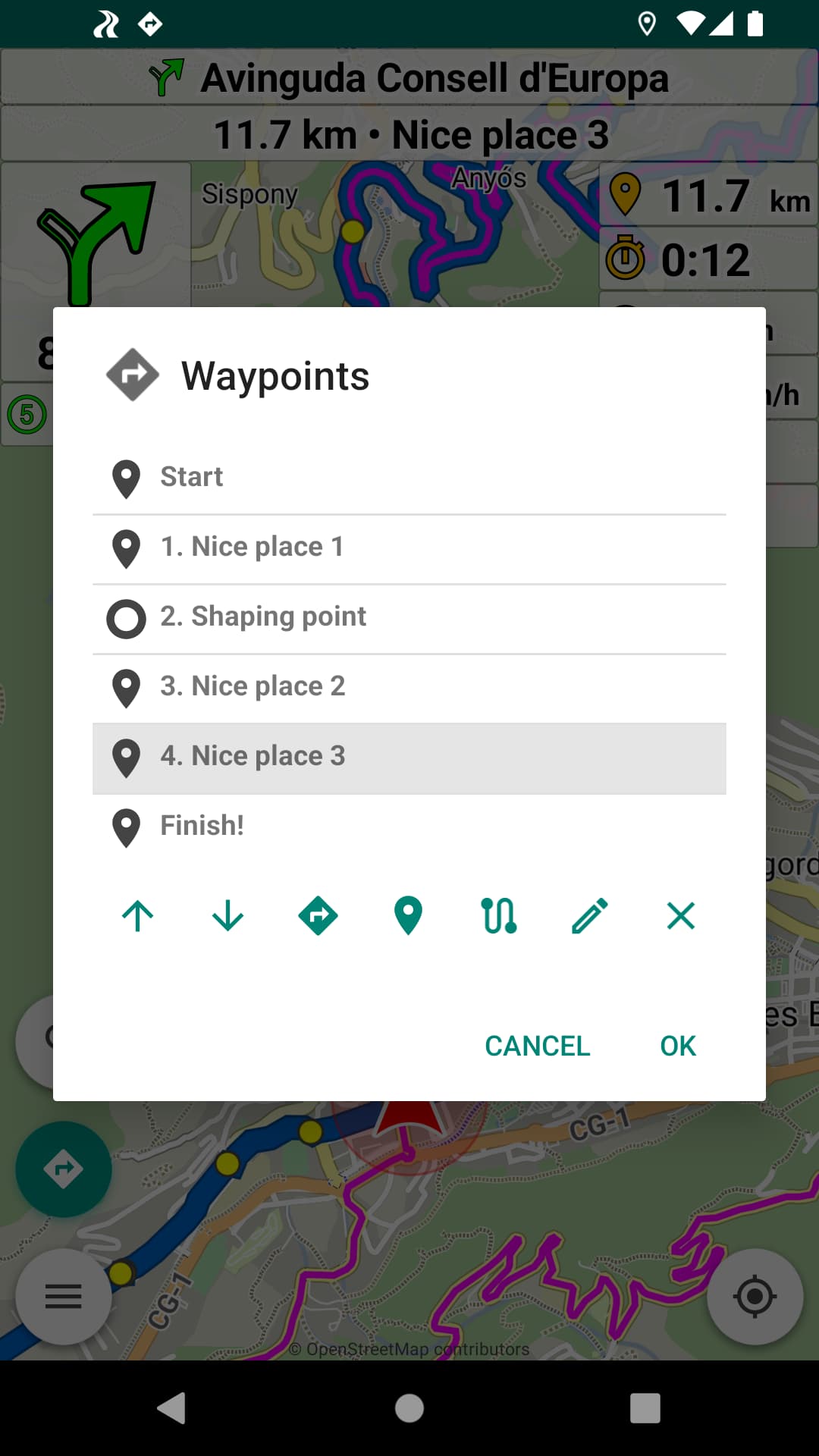
Indeed, waypoints you want to watch in the new waypoint panel
are usually those with custom names, i.e. the interesting points.
Waypoint 14, Point 15, #16, WP 17: numbers are not memorable.
In my opinion, it is not about remembering waypoints. When navigating, one just want to know the distance to the next waypoint. I don’t care what it’s called. Anyone can set waypoints or shaping points wherever they want. The one give it a name, others don’t care about names.
I find the abreviation “WP” universal, Garmin for example also uses “WP” as an abbreviation for waypoints by default.
But I also find “#” universal for a marker or waypoint. This does not need to be translated. Anyone who wants to name their waypoint can do so and has no problem at all interpreting # 14 as waypoint 14. What else should it be in a route planner and navigation system?
Anyone who wants can also interpret a problem into anything, like always in life.
Why not using glasses? Would solve some problems without destroying graphics and text at large zoom levels.
I had already mentioned elsewhere. No problem, I can tell again why. On the one hand, the temples hurt behind the ear at some point, and on the other hand, I don’t like varifocals. Besides, with glasses you always have an area where the frame is in the way. My distance vision without glasses is still good, (with single vision lenses visual acuity 1.2), only the middle and near range doesn’t work much without glasses anymore. That’s the way it is in old age. I can read the big font without glasses. That’s my preferred setting. I could just as well ask: why does this bother someone and why do you want to talk me into glasses or contact lenses? The Kuviger app is able to provide big font size. In don’t want anything else. Another question could be: who is seriously bothered by the abbreviation of waypoints with WP or # especially when most users seem to rename the WP’s anyway?
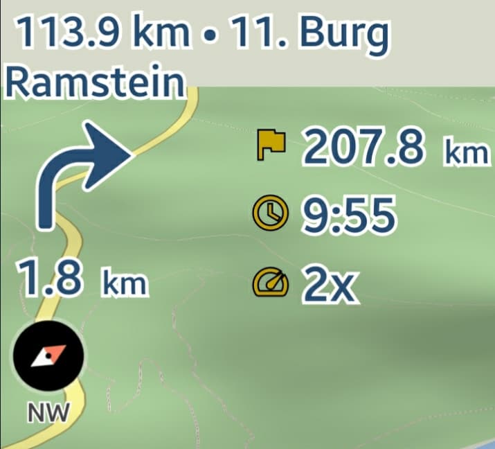
We can use the same display as in the waypoints list [Number. Name]:
- 11.7 km • 4. Nice place!
Or display the number only for unnamed via points:
- 11.7 km • 4. Waypoint
Would also work well and easy to implement I guess ![]()
After further testing I guess there is a little misunderstanding.
Before the change the font size in the next waypoint panel was the same as in the distance panel and a longer text was abreviated with 3 dots at the end. Now the size is smaller in the next waypoint panel and longer texts are written in 2 lines and not centered any more, but left justified. This I find not so good. It should be centered consequently.
Also I didn’t mean to keep the number if the waypoints have special names.
If the waypoint are renamed, then the number is not necessary and should disappear.
Additionally now that the number is listed first, 2 lines are not necessary, I would keep it in one line and same font size as the distance panel and abreviate with 3 dots at the end, for example “112 km • 4. Wegpun…” but if renamed then “112 km • Burg Ramstein” or with big font size “112 km • Burg R…” in one centered line above the distance panel and turn-by-turn symbol (in landscape mode it is correctly centered between the turn-by-turn symbol and the distance panel).
I had also secretly thought that shaping points would not be counted when numbering waypoints, so that they would appear consecutively numbered like 1, 2, 3, 4… (not in the planning mode, only in listing in the next waypoint panel). That was my thinking error. Now I perceive that the shaping points are counted and then after waypoint “112 km • 4. Wegpun…” would appear “225 km • 17. Wegpun…” for example. This is then a little confusing, deriving from human thinking: The driver knows in his or her mind that he or she has planned 4 intermediate stops, then the driver would know if heading to Stopovers 3 or 4 see “112 km • 4. Wegpun…”. If written as 17. or 18. waypoint, then no one knows anymore if it was the 1st, 2nd, 3rd or 4th planned stop ![]()
Hope I have explained it well now. ![]()
All is just a proposal, we are in Beta mode.
Thanks for the testing.
Everything to be implemented was mentioned above (no one answered):
No, the font size in all the top panels is the same.
It can not be too large as they show a lot of text.
We test different implementations in Beta.
This is how Android text views works.
I wanted to ask that, we can remove the numbers in named waypoints.
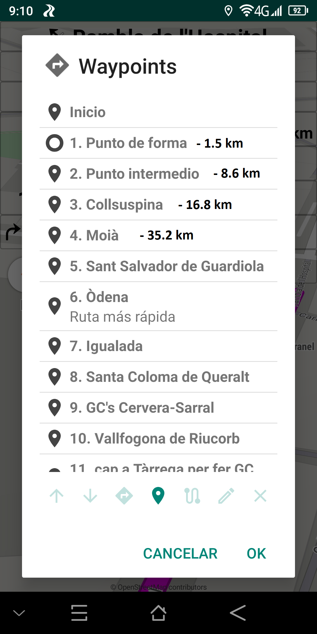
The numbering of the waypoints (via + shaping) is continuous (as on the website).
Otherwise it would be very confusing to use them.
That is why we have the custom names,
you should name the via points or use shaping points.
Precisely, we are in testing mode. ![]()
Your middle name I guess …
To make it clear: I will not use the next waypoint panel, the number in the distance panel is enough for me - so I don’t care about this discussion here anyway. And I won’t say anything more about the fontsize either. Not to mention the overlay apps, which steal the last bit of your map.
But: The numbering of the waypoints should remain as it is - basta!
As already mentioned recently: Why don’t you name your x waypoints as you want them, e.g. “(4) Burg R…”? Then would appear: “113.9 km - 11. (4) Burg R…”.
Just to save this little effort, all here should “dance to your tune”? Strange.
Because we are in beta mode - I’d like if Emux goes back to “waypoint xx” …
Precisely, we test things and I can revert anything. ![]()
Like the waypoint names or the App: Waypoint number in distance panel.
I have not yet decided on anything that will be final.
actually I wanted to ignore your comments, but this is a personal attack, which violates the forum guidelines. There seem to be people who have to give their two cents about everything, even if it’s inappropriate, such as contact lenses in response to font size, and who can’t stand it when someone disagrees with them.
yes thanks
agree.
ok didn’t know
1 Like
sure, no problem with that. We are living in a democracy and you are the boss ![]()
![]()
Very good to put the panel next waypoint and the distance . ![]()
As for adding the waypoint number to the name I don’t think it’s necessary, as I put the name I want to see just name and no need to add anything else (except the distance in front as it comes out now).
As for the waypoint example if I put the name “Burg Ramstein” I would like to see “112.5 km • Burg Ramstein” and not “112.5 km • 11.Burg Ramstein”, in this second case there are two numbers too close that can lead to confusion when taking a quick look at gps.
If we leave the original name now shows us “1.2 km • 1. Waypoint”, I like more “1.2 km • Waypoint 1”
I would also ask if the distance can be shown in the waypoints list
Good job, thanks !
Please create new topics to discuss new suggestions.
Waypoint numbers are dynamic (only names are fixed).
Rerouting, skip next waypoint, avoid roadblock change them,
as passed waypoints are removed (only next ones are used).
Waypoint numbers may be useful in routing, not in navigation.
Names should be set on important waypoints (used in panels).
Let’s return to the last more understandable name appearance.
As this panel is more useful to display custom waypoint names.
3 Likes