We just added a new map style to the Kurviger website. The map style is supposed to be sort of similar to the map style of the app. The map style is currently provided as BETA, so the map might load a bit slow or might not work for short times.
Please let us know if you find this new map style helpful and what should be improved in your opinion. Please also let us know if you don’t find the style helpful and prefer a different style.
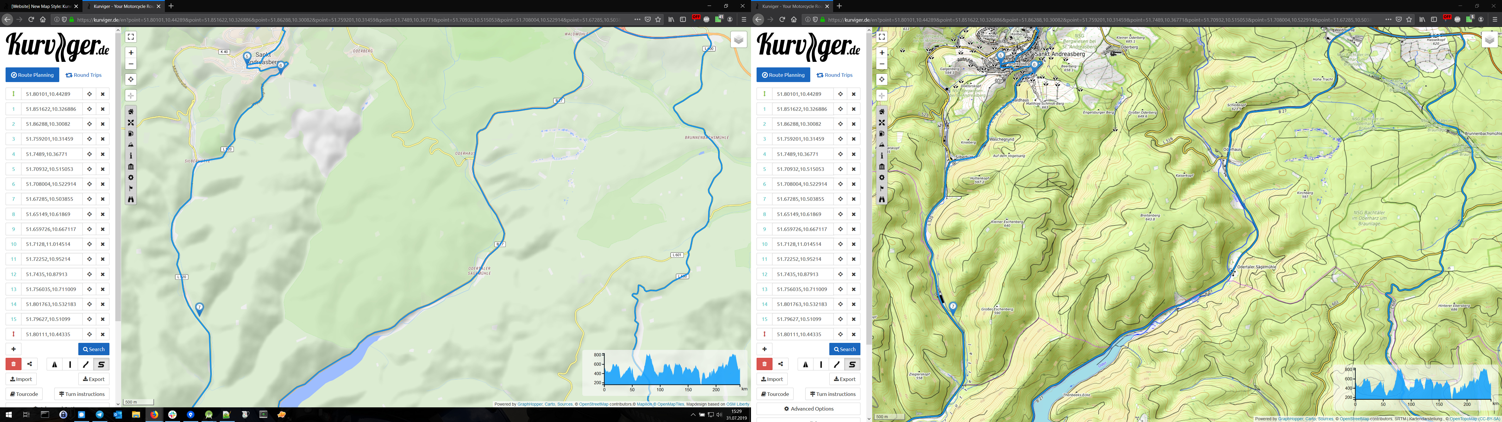
You can try the new map by going to the map style selection on the top-right and select “Kurviger Liberty (Experimental)”.
Hi,
could you please elaborate a bit, if the new style is 1 of the 15 maps, one can choose, or if the style is independent of the underlying map (ESRI, OSM…) and applied to all of them?
Thanks
hk
So, I have a bit more educated of an opinion on the map style now.
I think roads and road sizes are represented really nicely, much better than in Esri, Stamen and Mapilion. About on par with OTM
The flow of elevation between zoom levels is better than OTM, although not as accurate (but that’s not what it’s there for, it gives a better overview, fine-grained details will always be handled better by a real terrain map)
It shows rivers nice and early, clearly distinguishable, awesome! Much better than Map Surfer and a bit better than OSM. Lakes are clearly outlined and visible early on (cough cough, Esri Streets Lago di Garda Zoom level 7 cough cough)
And now for my only complaint:
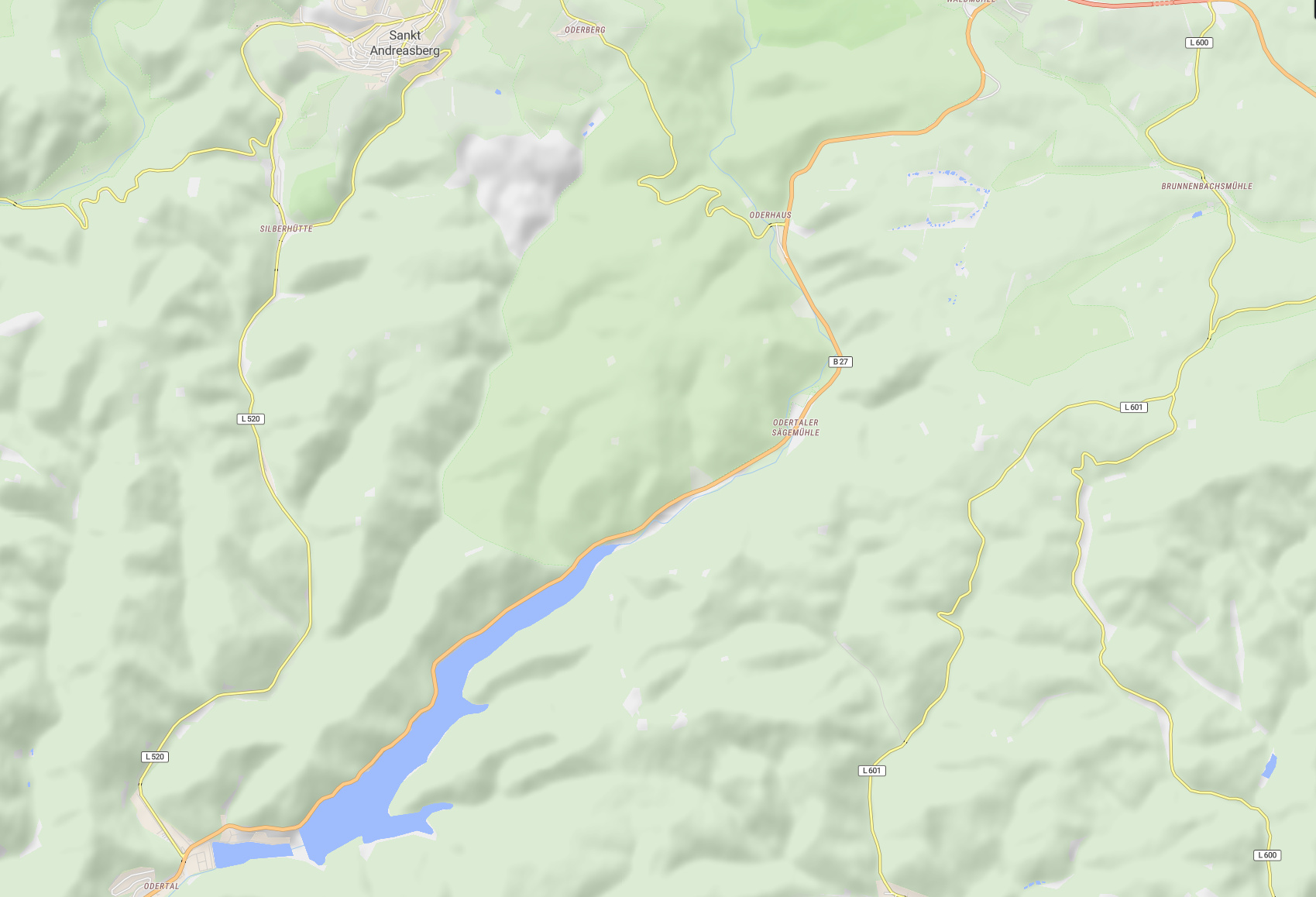
Something in Nature reserves / forest areas seems to be colored too drastically and they lose their topography quite abruptly, see example (Breitenberg, Harz. Liberty left, OTM right)
…finally a map which is very helpful when planning beautiful routes, so you can better estimate the landscape like in Google Maps or old paper maps.
So far I have changed frequently between Google and the Kurviger maps.
If that were also available in the app…
Expected that request. If it’s free like the others we have, I could consider it.
Note: this a raster map made by pre-rendered bitmap tiles of fixed size and has all the known disadvantages of bitmap maps on modern mobile screens of readability and blurriness.
So don’t ever expect the same experience with bitmap maps on mobile vs desktop.
App promotes the use of vector maps and especially the offline vector maps which will always have the most work and care.
The idea of that style was actually to provide the website with a way to have style that is sort of similar to the regular app style. Have you tried the hillshading (“Zeige Berge”) option in the Kurviger Pro app?
I can reduce the strength of the color there a bit, but then these ares will be harder to distinguish:
In your example the colors are are better, but the thin green border around those areas are missing. With this thin border and maybe a only little bit darker color, the areas should be good to distinguish without loosing the hillshading.
hmmm, we’ll need to find more examples I think, because enforcing the border more could look really strange especially in mountain ranges, where there isn’t actually a border, much less something that looks like a crevasse, a fault or a tiny river