Really? In the current “Kurviger Liberty” style it looks like this and it’s quite Ok in my opinion (regarding the thin border, not the layer color reducing the shading):
At the first look to this map: Very nice! Compliments!
Until now I often prefered “Top Plus for Germany and Europe”. But that’s a little bit colourful, sometimes names of villages and towns bad positioned.
Feedback to Kurviger Liberty:
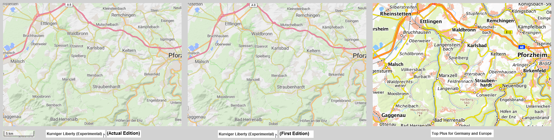
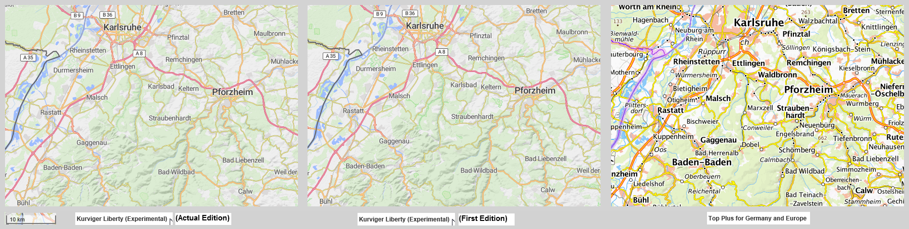
For testing the new map I took different zoom levels. So I took scale 10 km, 5 km, 2 km, 1 km, 500 m, 300 m, 100m. Compared the new map with Esri street, OpenStreetMap DE (FAU), Mapilion OSM Bright and Top Plus for Germany and Europe.
At Kurviger Liberty I am missing a stronger contrast of the area of villages and towns (area with buildings). Is it possible to give this areas a stronger colour? It must not be as strong as at Top Plus for Germany and Europe. For me it’s nice to recognice this areas in the map.
At testing I took my home area (Pforzheim, Karlsruhe, Nagold). At scale 10 km I’m missing some roads (Nebenstraßen), which are e.g. in esri street. At scale 5 km (often used by me for routing) I’m missing some roads, which are in esri street and Top Plus for Germany and Europe. Even at scale 2 km there I’m missing a marginal number of roads (normal width, not narrow). At scale 1 km these roads are visible. If wanted, i can give some examples at the weekend.
Nevertheless it’s a nice map. But if you like this country roads (normal width for two passing cars, not narrow) between villages, then it would be fine recognicing these roads at scales of 10, 5 and 2 km. Better recognicing of village and town areas would be fine, too.
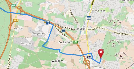
Wenn ich einen Routenverlauf im Detail festlegen will, nutze ich lieber Map Surfer, diese Karte erhält wesentlich mehr Hinweise als Liberty. Z.B im Bild die Kiesgruben links oder die Hügelbezeichnungen rechts. Aber je nach Zoomstufe sind manche Straßen bei Liberty besser zu erkennen. Ich werde deshalb bei der Routenplanung immer mal wieder umschalten.
If I want to define a route in detail, I prefer to use Map Surfer, this map gets much more hints than Liberty. For example, in the picture the gravel pits on the left or the hill markings on the right. But depending on the zoom level, some streets in Liberty are easier to see. That’s why I’ll switch over and over again when planning my route.
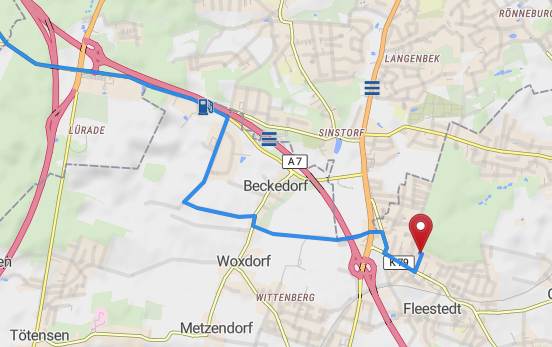
Map Surfer
Liberty
Thanks again for all the helpful feedback. I am happy to let you know that I just pushed some serious improvements for the Kurviger Liberty style.
Added
I added a bit more contrast, let me know if you think it should more/different.
White I wasn’t able to change too much about this, I was able to slightly improve this.
Added them
I added those as well
I updated the names to use the local names.
I still have one or two minor things on my list that will be added over the next weeks. If you find anything that should be improved, please let us know!
Nice how you work in the wishes of the feedback. Thanks a lot!
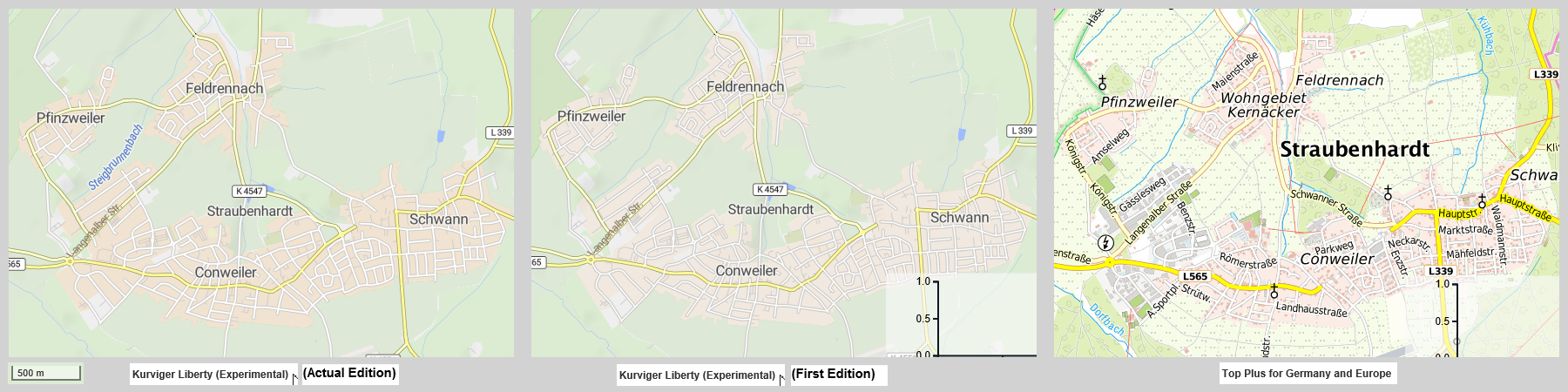
To let you know what i think and to bring my points following i show you the solutions of different map styles (clicking on the pictures show them increased):
Scales 500 m and 1 km: The areas with buildings in the actual edition now are good to recognize. Perhaps the colour a little bit stronger (But not as strong as in Top Plus for Germany…).
Scale 5 km: The areas with buildings are recognizable but not very good. The gray colour for me is a little bit to weak. Is it possible to take a darker gray or eventually use a little bit of red like in scale 500m and 1 km.
Scale 10 km: At this scale the areas with buildings are recognizable bad with a weak gray only at bigger villages and towns. Perhaps here can be displayed more using a colour as mentioned at scale 5 km. At Top Plus for Germany … there are more such areas recognizable (but this strong colour don’t fit to the style of Kurviger Liberty).
At scales with less than 500m and scales with more than 10 km it’s fine at it is.
Above just my opinion not knowing if there are relations betweeen the styles at different scales. It is an advantage to the other map styles to increase the usability of Kurviger Liberty for planing routes with setting of waypoints (not only using the Kurviger algorythms).
PS: The point with the roads (Nebenstraßen) will follow in a separate reply. First i have to work out my explanations.
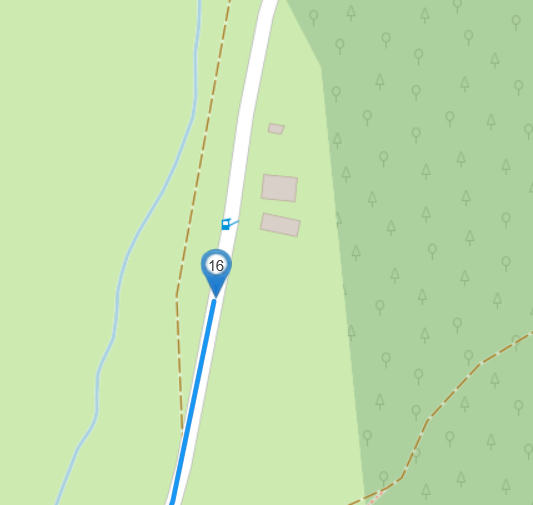
Road Holzbachtal to Schwanner Warte (ohne Mittellinie) Kurviger
Road Bernbach to Moosbronn (mit Mittellinie) Kurviger
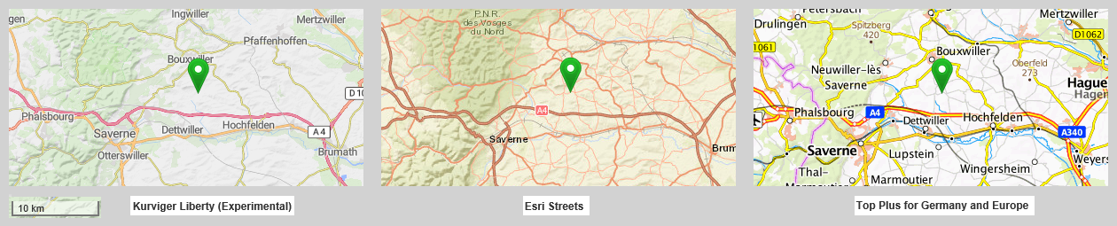
Alsace D59 (near Saverne, mit Mittellinie) Kurviger
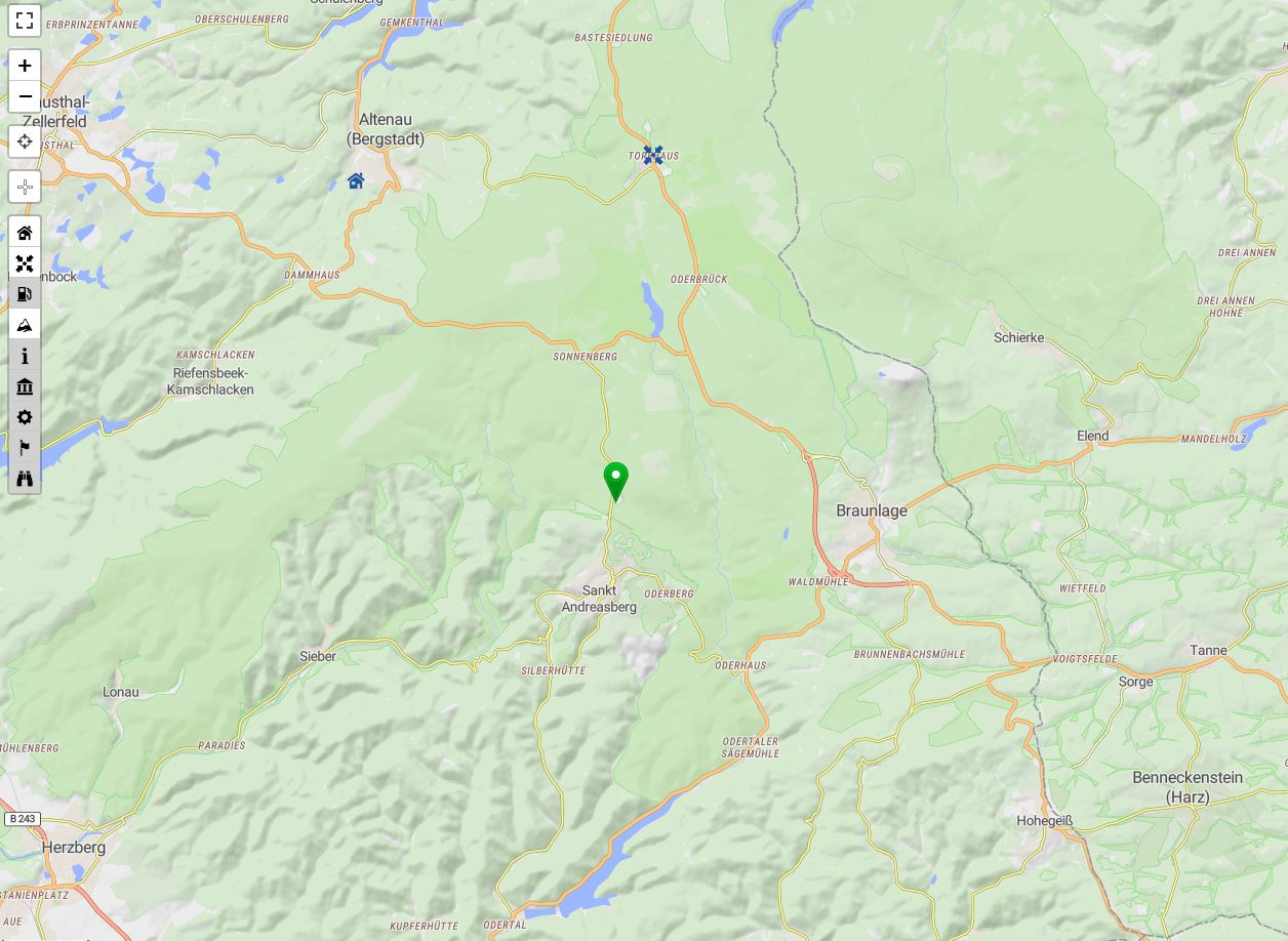
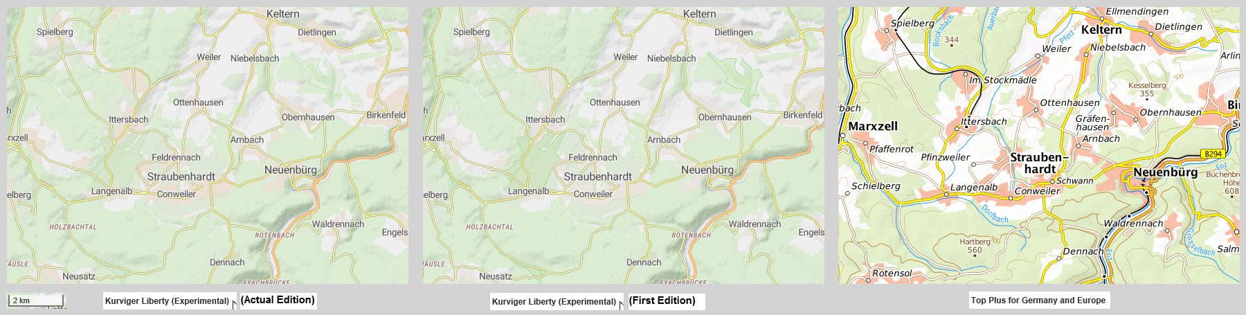
For shortlink 4 (Alsace D59) following a comparison of the map styles from actual Kurviger Liberty, Esri Street and Top Plus for Germany and Europe at different scales (clicking on the pictures show them increased).
Scale 5 km: The road at the waypoint and some others are easy to recognize at the map styles in the middle and on the right side, but not at Kurviger Liberty on the left side of the examples.
Scale 10 km:The road at the waypoint and some others are to recogize at the map styles in the middle and on the right side, but not at Kurviger Liberty on the left side of the examples.
It would be nice to recognize such roads at scale 5 km and even at scale 10 km in Kurviger Liberty. This proposal is made not knowing why at the current version it’s not possble to see them. Is it at the style, the algorythm or the OSM data? Perhaps it’s to find out and to implement it in the map style. Thanks in advance.
Thanks for the detailed feedback @WalterG. I just updated the Kurviger Liberty to us stronger colors for the residential areas, also for zoom levels around 10km I use the brownish color instead of the gray one.
I agree that some of the smaller roads are shown rather late. Unfortunately, showing them is not that easy . This might be something we could change in the long-term though .
Thanks for the fast work. Was checking scales from 500 m up to 300 km.
For scales 500 m up to 10 km the residential areas from each village or town are fine to distinguish from the not residential areas around them. That’s much better than before.
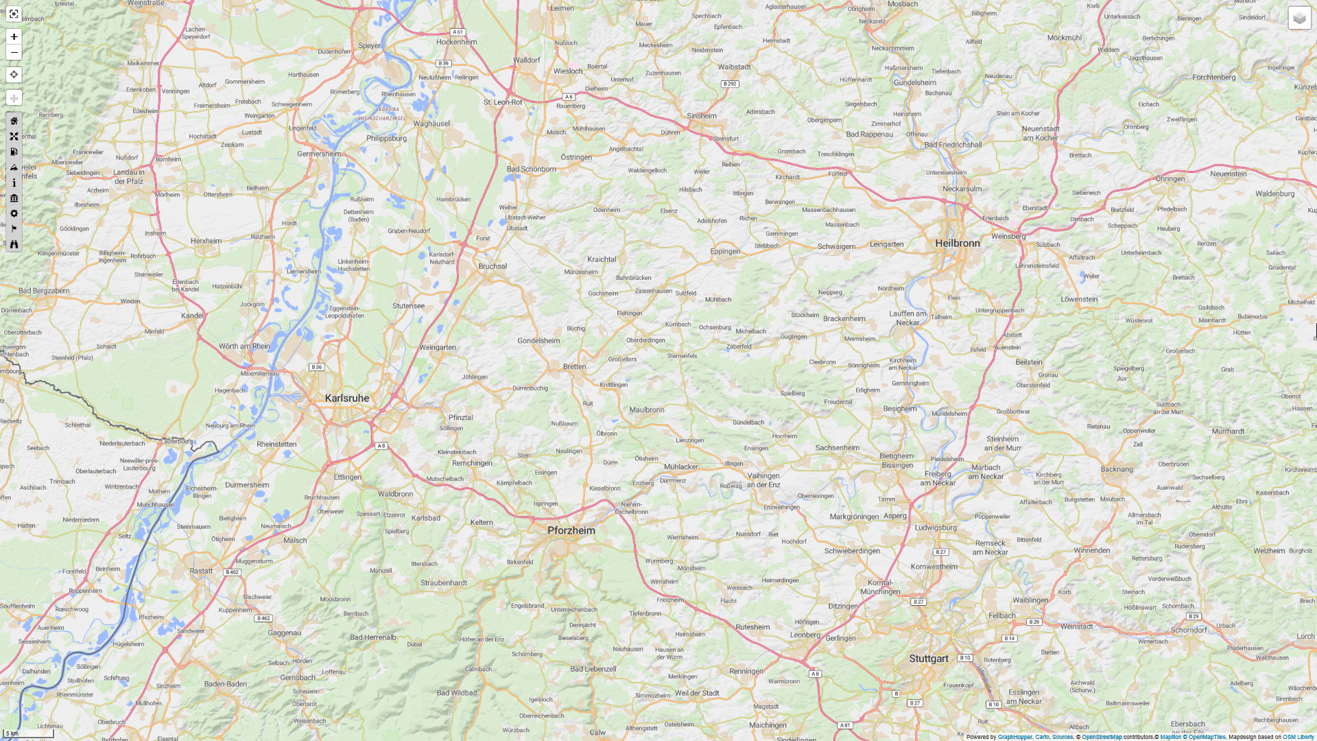
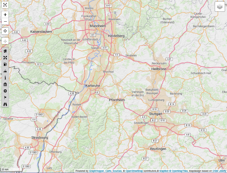
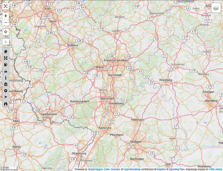
But ooops! From scale 20 km up to scale 100 km the residential areas of neighboured villages with not residential areas between them suddenly are displayed as one big residential area. This behaviour is shown at the example of the area of Hockenheim - Heilbronn - Stuttgart - Karlsruhe. In this area for example the area of Stuttgart -Heilbronn is recognizable as one big residential area. This behaviour you can see at the scales from 20 km to 100 km. Following you find the pictures from scale 5 km to scale 300 km:
Scale 20 km: residential areas of the area Stuttgart - Heilbronn are no more seperate areas, there only is one big residential area. That’s confusing. As recognizable, this behaviour is not only at Stuttgart - Heilbronn, it’s at other areas too (in the picture e.g. Karlsruhe - Mannheim - and more). This behaviour should be avoided.
Scale 100 km: The same as above. At this scale perhaps only showing the residential area of big citys. The behaviour described for scales 20, 30, 50 km should be avoided.
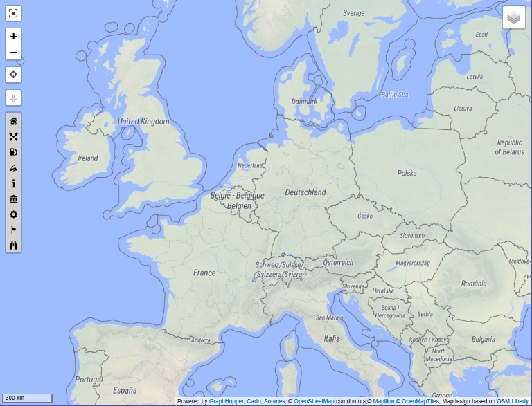
Scale 300 km: There are no residential areas. That’s ok.
I can’t remember, if this behaviour was in earlier Kurviger Liberty versions. I know it’s easy to make this criticism not knowing what work is to do to make it better.
Yeah, nevertheless Kurviger Liberty is on a good way.
The color and shading of residential areas now just has the prefect mixture.
Residential areas can be recognized without being too prominent.
Isn’t Stuttgart - Heilbronn just one big residential area
But admitted the transition from scale 10 km to scale 20 km is a bit harsh in this area.
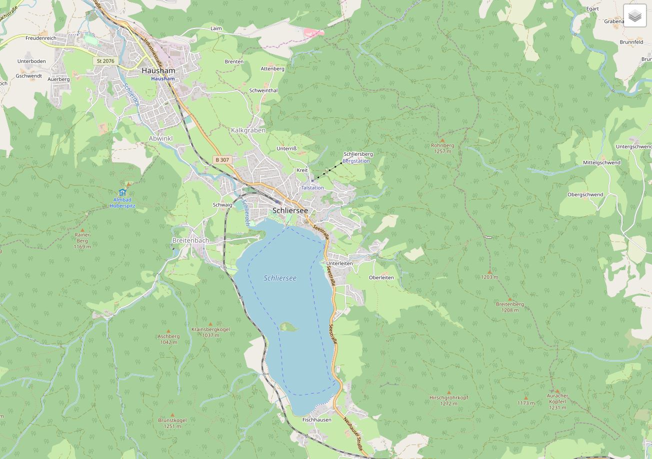
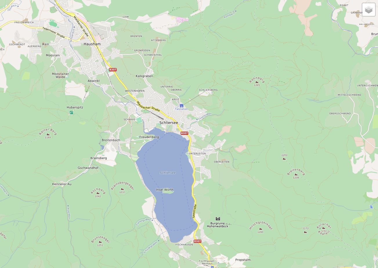
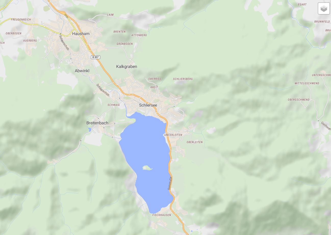
It feels better in the Munich area.
I guess it is difficult to find the right compromise between merging smaller residential areas into a big one, and let the smaller areas dissapear.
 Only other map (except from terrain and satellite ones) that’s missing those is Mapillion.