We have received quite a lot of feedback about our recent redesign, thanks for that.
One major point for critique was that you now need to click multiple times for certain actions (like playing with curvature and avoidances, or for saving a cloud route).
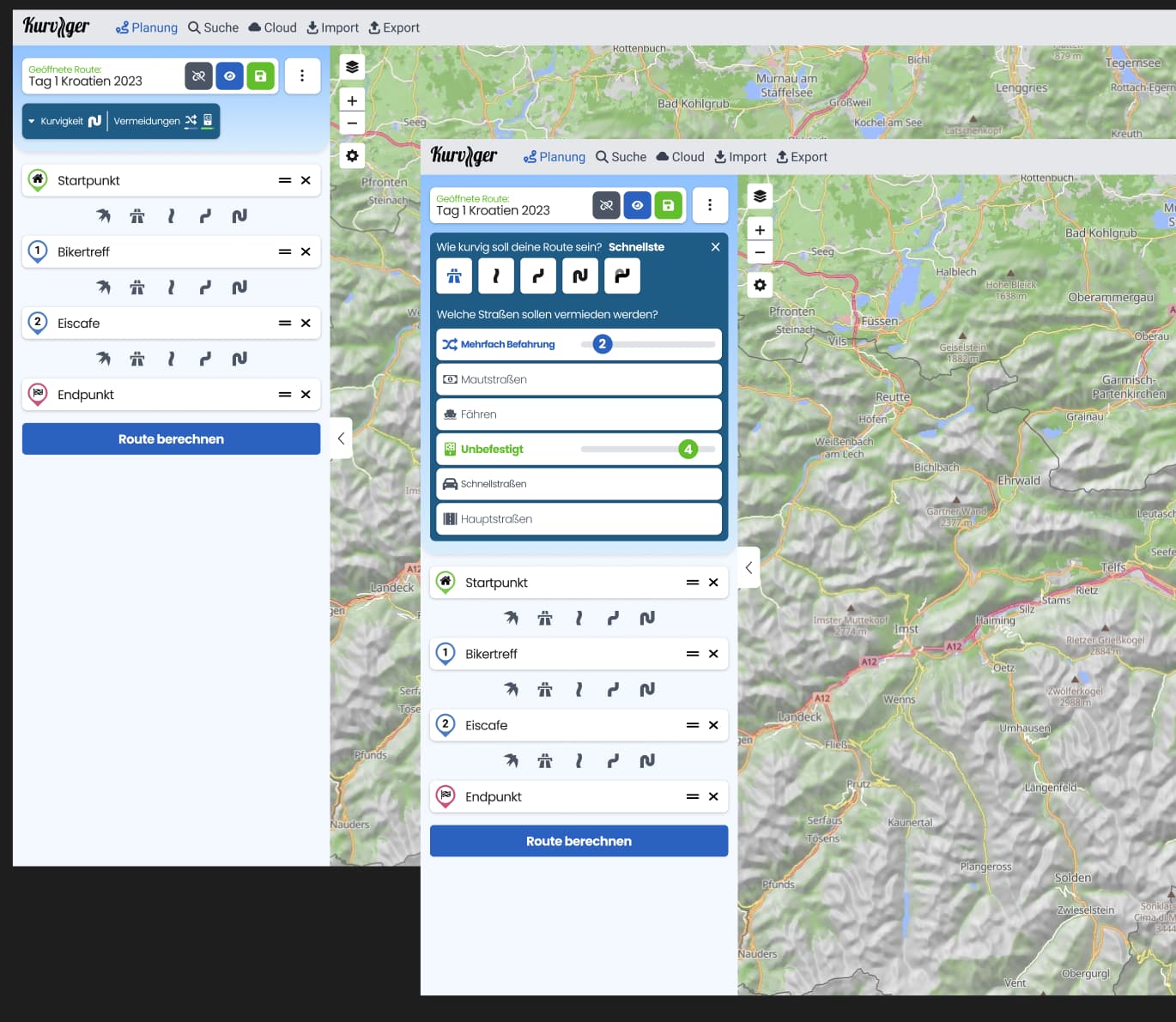
That’s why we came up with an improvement, attached you will find a potential design idea, how we could reduce the number of required clicks for the desktop version (mobile will remain as is).
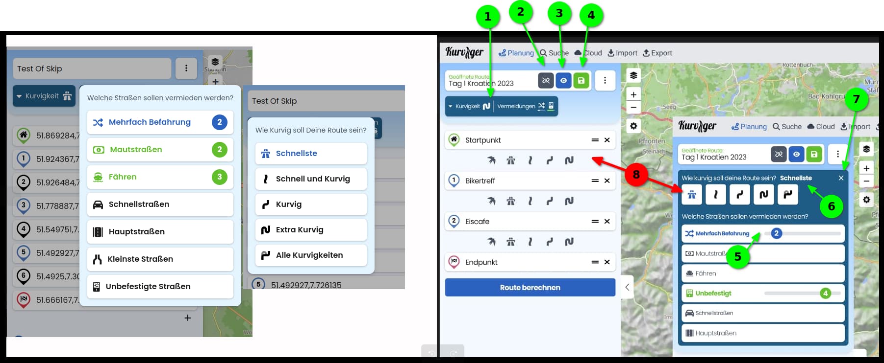
Unlinking the loaded route from the cloud route (might be move to the …-menu)
Show/hide the planned route (might be move to the …-menu)
Save the route
Curvature/Avoidance - this is now an expandable area, that you can expand with one click and close with another click. While expanded you can change the settings without having to reopen them again.
We hope that this will help avoiding too many clicks? Please let us know, if you think something won’t work at all for your use case.
I am looking for some minutes at both screens (current + proposal) and I have no clear preference. The proposal looks even nicer and faster, but I could surely live with both.
In case it is no big effort, I would choose the new proposal. But if it is worth to change again with little feedback? It also could lead to confusion, the more as it would differ a little bit from other devices?
Habe mal beide Versionen nebeneinander gelegt und wie @toffel mal wirken lassen. Mir gefällt der neue Vorschlag in Summe besser weil genau der Punkt direktere Bedienbarkeit deutlich besser abgebildet ist.
Gedanken dazu:
(1) ein Button der das Fenster öffnet für alle Einstellungen weniger Klicks wenn man von Kurvigkeit zur Vermeidung rüber will und umgekehrt. Gerne dürften der Button auch “zweizeilig” sein und die deaktiven Element mit aufführen. Und der Button darf gerne auch im Blocksatz sein.
(2) gerne in dieser Ebene belassen damit man unmittelbar und immer sehen kann wogegen man arbeitet.
(3) Bin nicht sicher. Route ein- / ausblenden in der Planung? Ist doch das Ding an dem man arbeitet.
(4) Auch gerne in dieser Ebene belassen, gespeichert wird ja immer wieder.
(5) Bin nicht sicher: Slider kennt auch “aus” oder unmittelbarer Switch zwischen “aus” & “1-5”. Sliderposition “aus” wäre mir genauso recht. Anzeige Defaultposition ?
(6) Textanzeige für aktive Kurvigkeit, ausreichend.
(7) Exit / Quit / Schließen
(8) Layout von rechts auch für links übernehmen? Wäre was für’s Auge.
I put both versions next to each other and let them work like @toffel. Overall, I like the new proposal better because the point of more direct operability is clearly better illustrated.
Thoughts on this:
(1) a button that opens the window for all settings fewer clicks if you want to switch from curvature to avoidance and vice versa. The buttons should be “two-line” and the deactivated element should be included. And the button can also be justified.
(2) I would like to pale in this layer so that you can always see what you are working against.
(3) Not sure. Show / hide route in the planning? Isn’t that the thing you’re working on?
(4) I would also like to leave it at this level, as it is always saved.
(5) Not sure: Slider also knows “off” or direct switch between “off” & “1-5”. Slider position “off” would be just as good for me. Display default position ?
(6) Text display for active curvature, sufficient.
(7) Exit / Quit / Close
(8) Copy layout from right to left? Would be something for the eye.
My vote also goes to the proposal for the new layout!
Above all, the additional buttons, and in particular the “Unlinking the loaded route from the cloud route”-button, are additional functions that I have been eagerly awaiting…
I can live with the fact that the new design is “too colorful” and “too playful” (for me) if the functionality is there. I really just can’t understand the different “shades of blue” for each the color gradient, the dropdown menu(s) and the default buttons.
Da geht es ums Cloud-Overlay . Sorry falls ich das etwas unklar beschrieben habe. Die Magenta Linie.
Links Klicken für an&aus, Slider für 1-5. So ist glaub ich der Plan.
Du meinst zwischen den Wegpunkten in der Wegpunkt-Liste? Ich glaub ganz ehrlich das würde eher nicht 100% passen.
Zum einen, der Platz. Das passt nicht vernünftig auf sehr vielen Geräten. Und die Klickflächen werden zu klein. Wir sind selbst für Tablet aktuell eher beim aktuellen Redesign, anstatt der überarbeiteten Desktop-Version, damit man sich nciht unnötig verdrückt.
Yes I know . We could just change these buttons and not curvature and avoidance buttons, so we can discuss these separately BTW
 weniger Klicks wenn man von Kurvigkeit zur Vermeidung rüber will und umgekehrt. Gerne dürften der Button auch “zweizeilig” sein und die deaktiven Element mit aufführen. Und der Button darf gerne auch im Blocksatz sein.
 ?
?