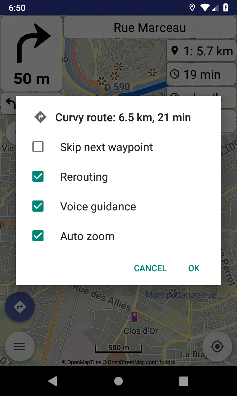
That’s was exactly my initial idea and implementation! A list of equal check boxes where everybody can check whatever wishes. “Skip” is just one of them, cleared each time.
Indeed an option should not be more prominent than others, as everyone has different needs and preferences.
If you mean an extra button below, with ok / cancel, that’s not optimal:
Dialog buttons should have minimal text, “Skip next waypoint” is very large text.
In future will have more actions, cannot have buttons for each in dialog buttons.
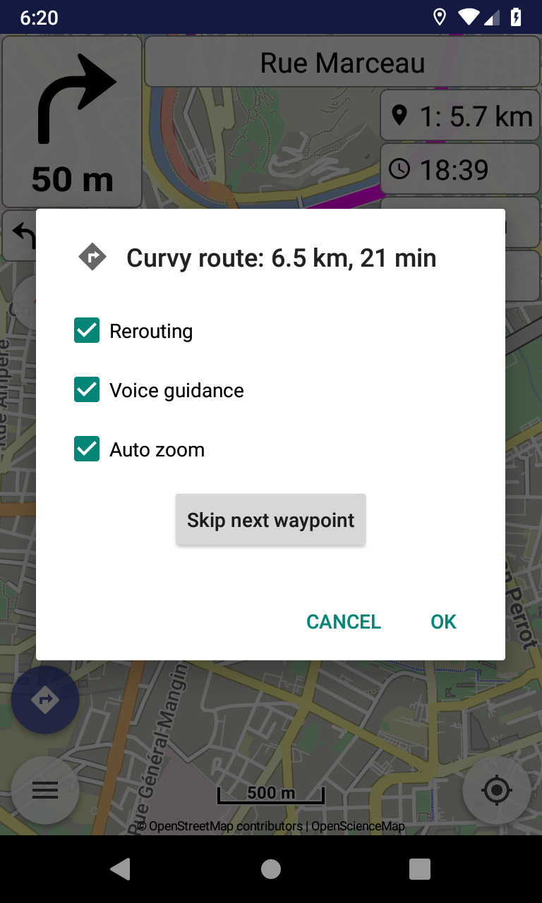
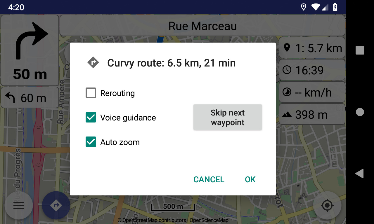
I suggest differentiating what I would call “Actions” such as Skip next waypoint from “Options” such as Rerouting. This could be done by using quite large icons for “Actions” and text for “Options” as at present. Since one cannot use the screen for anything else while this dialogue is showing, the dialogue could be made larger if need be.
I would like to see an additional “Action” for cancelling the route - “clearing” in Kurviger terminology - on this dialogue screen.
This menu is meant more for navigation tasks, to be done efficiently while navigation continues.
What is the purpose for clear route (i.e. stop navigation) and not use the current available ways?
It is marginally quicker for one and would also be consistent with the interface in Locus Map Pro which is the other navigation app I use. I do appreciate that this is not necessarily a factor in your thinking however!
Let’s see what can get in that dialog.
We certainly discuss all user ideas here!
Such clear route action, stops navigation and removes the route from map, without questions.
Alternatives would be use navigation button and clear route in various places (e.g. left menu).
Regarding the design of “Skip next waypoint” entry, don’t have strong opinions, but if asked:
a) “Action” (immediate response of app) or “Decision” (needs a second tap to confirm?
-> Decision: It needs one more tap, but enables control and revision if decision was made by mistake;
skipping a waypoint by accident (and perhaps not noticed) may cause much irritation, and the decision to skip next waypoint is nothing you do frequently, so one more necessary tap should not be a strong argument against.
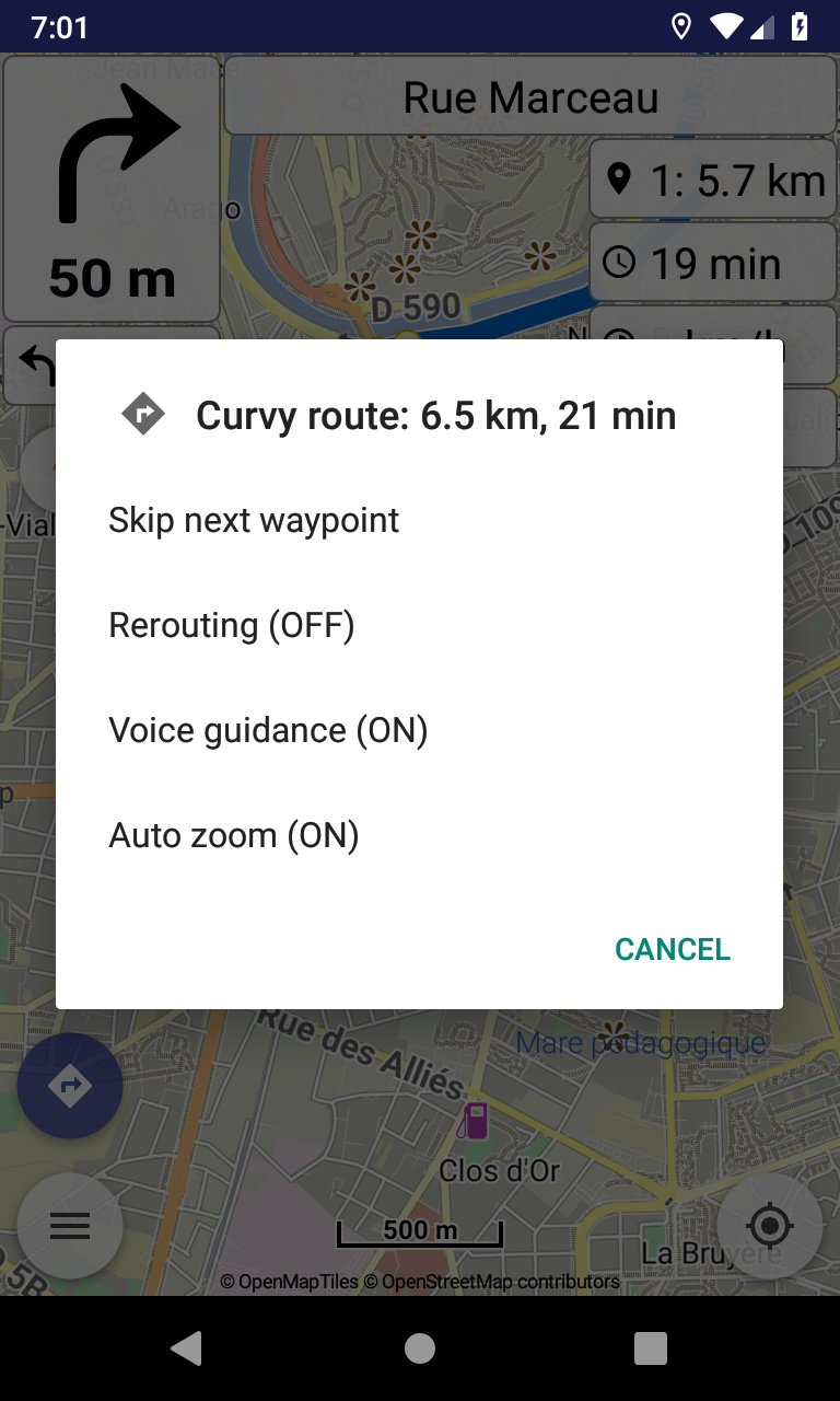
b) Check box (set a check mark) or check line?
-> Check box: Check boxes are more consistent with all over design of app? Or planned to revise design in general?
I think this option is not ideal, because people have to read the on and off state of the button and cannot use checkboxes. People are used to checkboxes for these things.
I think this would be my favorite approach for now . We can always improve it