While navigating, is it possible to make the destination widget in the left lower corner smaller so the actual navigation is happening more in the centre of the screen instead of in the lower right corner where it’s happening now?
1 Like
Do you mean this area (marked area)?
In the 3D view, the navigation arrow is at the bottom center:
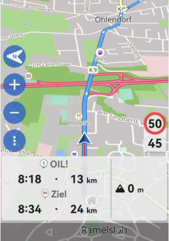
But what do you mean with “instead of in the lower right corner where it’s happening now” ?
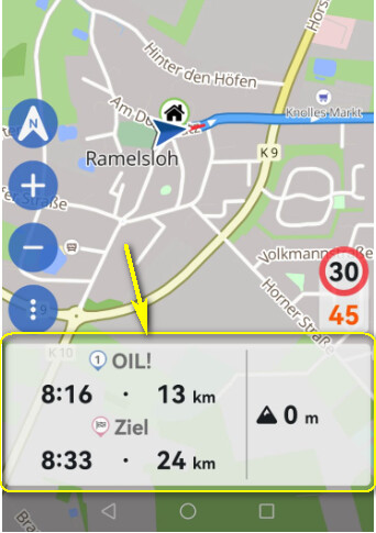
I tried to simulate quickly what I mean. In reality, when I was using Kurviger Navigation for the first one on my Android phone, I had situations where the blue navigation arrow (“me”) was almost completely in the lower right corner.
I think if the Destination widget in the lower left is made smaller, current there is a lot of wasted space, there will be more space for the actual navigation to move to the center of the screen.
2 Likes
Correct. This happens in landscape.
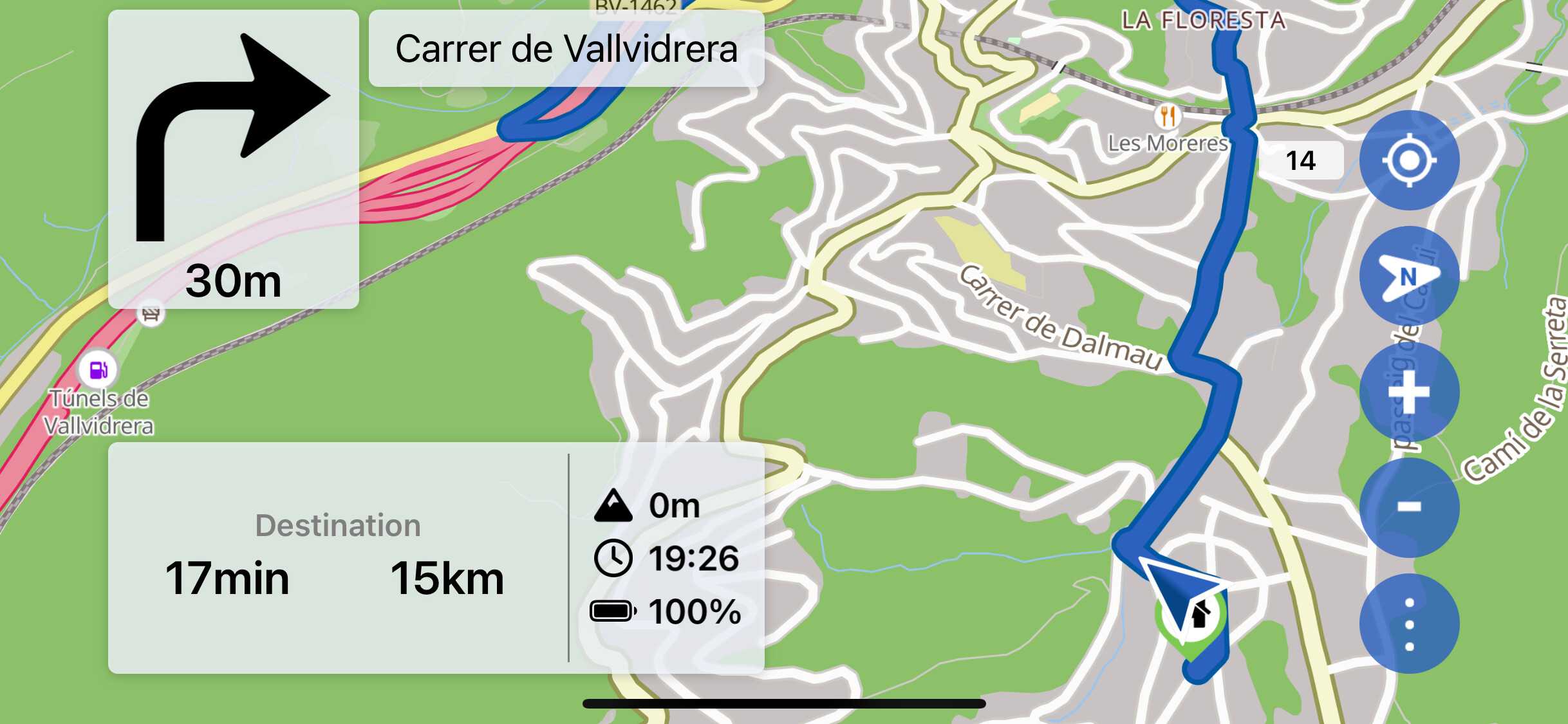
Mal ne schnelle Montage, wie es aussehen könnte für mehr Platz.
A quick assembly of how it could look for more space.
1 Like
The challenge is that the layout should work on many different screens and resolutions.
On one screen it looks as if space is being wasted, on another everything is tightly packed.
Some are bothered by the fact that the position arrow is not in the center of the screen, the next needs an extra large font, very difficult all that.
3 Likes
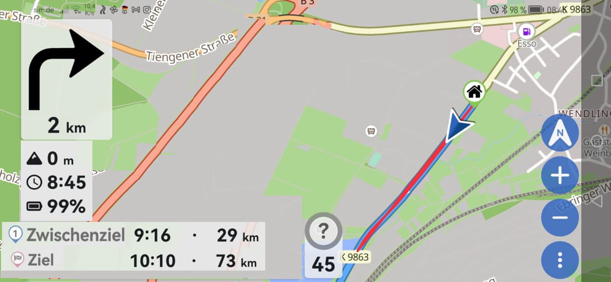
Thanks for sharing the screenshot. So this is already very important, because this is an iOS screenshot. In general, our iOS UI is not yet as optimized as our Android UI. We do have a few things on our list already to further optimize the UI, first we will have to implement a few missing features for iOS though ![]() .
.
2 Likes
Yes, this is an iOS screenshot because my Android phone is on my bike. But the same happens on Android. I don’t really care about the iPhone app for navigation. I use the web for planning and Android app for navigation.
Maybe move the Zwischenziel widget to the top-right so the nagivation arrow can move more to the center?
1 Like
Hey, just sending suggestions to make an already awesome app even better. I did some tests with different apps (see https://www.transalpowners.com/threads/roadsync-android-vs-apple.400/post-4784) and Kurviger was the clear winner, so no worries there. ![]()
2 Likes
Ah ok, so that’s the reason why I asked for a screenshot, so we get a better feeling how it looks on your phone. Maybe you could post a screenshot the next time you are riding, this would help us better understand ![]()
There are literally 0 phones out there on which this would look good or even fit at all ![]()
Height real estate is super limited and it’s a difficult structure to manage. Your assembly even leaves out the “next instruction” which would need to fit below the “2km”
We really appreciate all your input on these things, that I have to stress. But please believe us when we say we’ve already invested a lot of design thinking into these problems to get to the state we are now ![]()
3 Likes