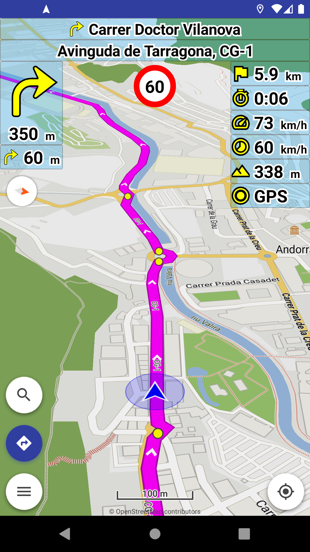
Map in the view
What map did you use in the view? Did you use the curvy offline with high contrast or an online map in the image?
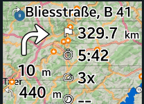
Karte in der Ansicht
Welche Karte hast du in der Ansicht verwendet? Hast du die kurviger Offline mit hohem Kontrast oder eine Online Karte in dem Bild im Einsatz?
Personally, I think that text in any color other than black or white looks awkward.
But others may feel differently.
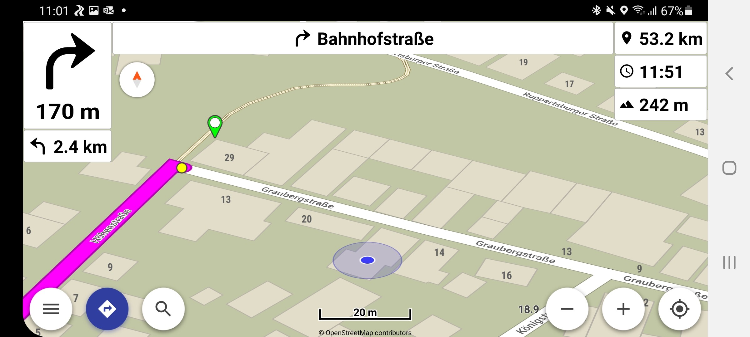
BTW, I preferred the old appearance without the stroke around the text.
In my opinion, that stroke around the text is only necessary, if you set the background too transparent.
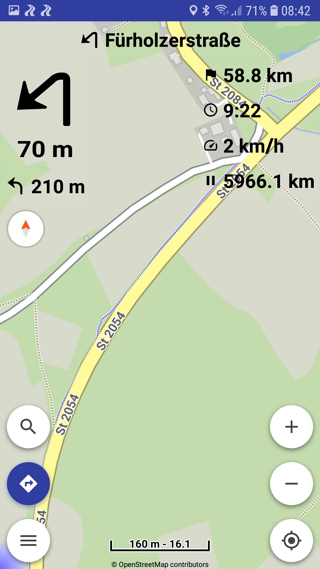
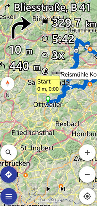
One issue: I want to use 100% transparency for the navigation bars, but I still see solid borders on every bar. How do I get rid of the solid borders? I also want them fully transparent.
Also why is there a white border around the black font? How can I configure solid font colors or how separately configure the font border?
Yes absolutely, please make it available again. It should be possible to my point of view to make the border fully transparent and also make the text solid without any borders (or of the same color as the filling), at least as a configurable option. This white on black or black on white for fonts or any other double-colored font may be ok in the future, but at the moment I don’t like this at all and I don’t like to not beeing able to change it.
@linux-user
How do you get the font color at least solid black again like in Kurviger 1 Pro?
Furthermore I just discovered the same problem as mentioned before that two buttons are marked in blue and none of them is working. When pressing on proceeding the route after pausing, it doesn’t work. I had the effect again yesterday on the tour with Kurviger 1 Pro and now again in Kurviger 2.0 in simulation mode. I don’t know when exactly it happened. I was just simulating a tour and then played around with the color option and suddenly the program hangs, the tour can’t be proceeded, nor can it be stopped and started again. The program has to be quited and started again. It is like an endless loop for the current tour.
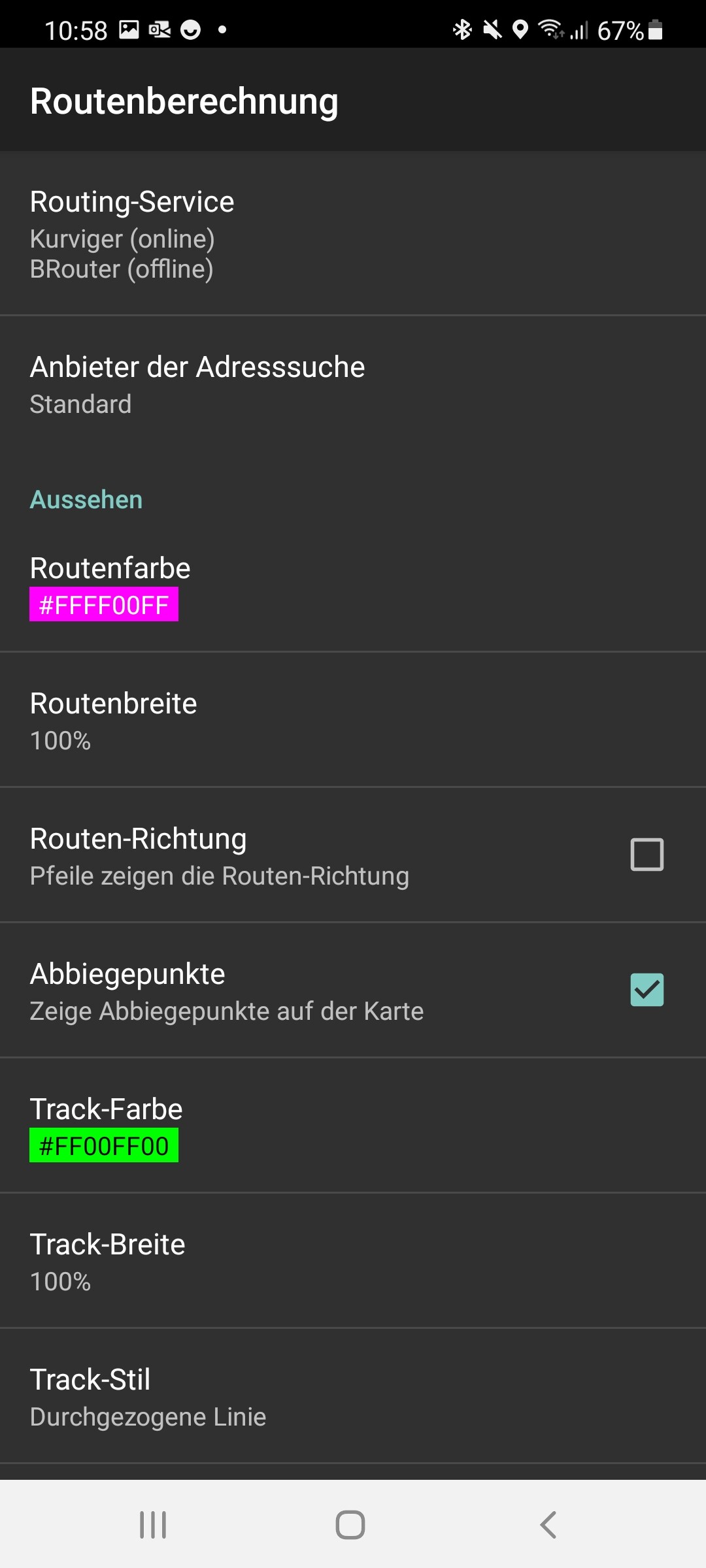
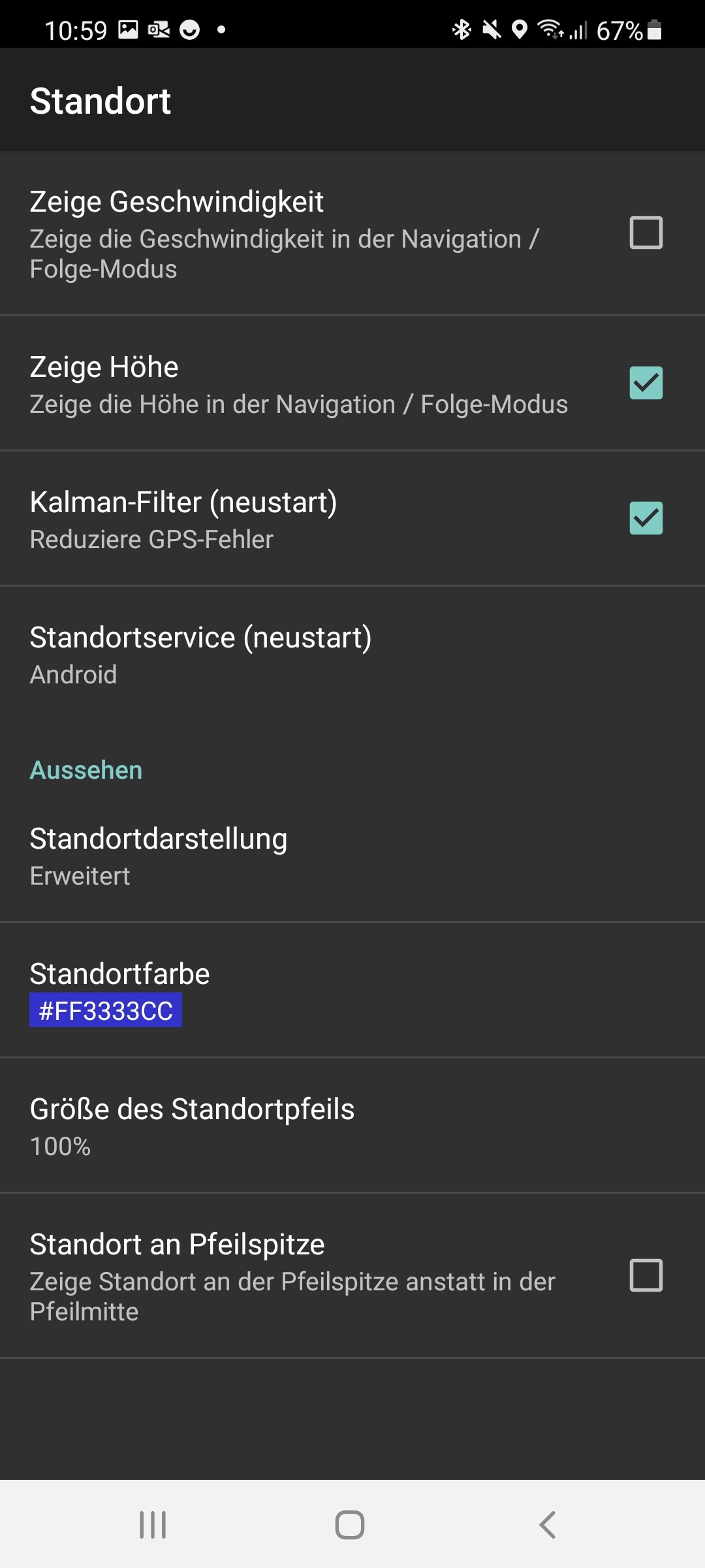
The Text color depends on the color of the background: Setting | Application | Display color (background)
A = 0
R = 255
G = 255
B = 255
=> Black text; 100% transparent background
A = 0
R = 0
G = 0
B = 0
=> White text; 100% transparent background
But with Kurviger 2.0.7 you have always a small line around the letters.
This design should make the text better readable.
App development cannot be based on polls (where only some users participate).
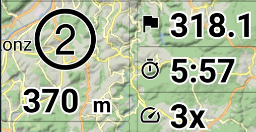
Maybe you, but development must take care of all the users. Everything on map, icons and text have shadow from the start.
Navigation gets its now, like most apps already have.
Independent from the navigation bar borders I don’t even succeed to get a unique color for the content, either it black on white or white and black and the arrow is always different
Please invest some time and play with the new settings.
Does everyone want to fill the app with options and add a setting for text color too?
The text color is described above and works like in the past.
(it is based on background color and is demonstrated in color selection dialog)
For black text, select light background (and make it transparent).
You can change the background color and the rest of the foreground color.