Perhaps it could even be presented more clearly. Self-explanatory.
1 Like
And then the next is asking “what’s the difference between all this colors?” ![]()
![]()
I think 99 % of all users come clear with the current display!
2 Likes
Likewise with color Marconi even thought of the other 1%. ![]()
So that they too quickly found the right panel and buttons. ![]()
https://www.pa3esy.nl/military/gb/airforce/t1154/html/t1154-set.html
2 Likes
I like the color enriched version of Willy.
It is not just about comprehension.
The colors make it easier to grasp the corresponding distance at a glance.
Seems overloaded and colors are still hard to understand.
Then there will be requests to change the info bubbles too.
They are simple texts and texts cannot have colored parts.
So we better keep it simple with text & unicode characters.
1 Like
Development effort is a striking argument
1 Like
If there is a good suggestion for unicode characters, I can examine it.
e.g. as we use ↗ ↘ for elevation
Perhaps for start a house icon ![]() (U+1F3E0) and for destination a chequered flag
(U+1F3E0) and for destination a chequered flag ![]() (U+1F3C1) - according to website icons:
(U+1F3C1) - according to website icons:
There are some colored unicode circles:
🟡 20 km, 1:05 - 20 km, 1:05 🟡
🟢 40 km, 2:10 - 40 km, 2:10 🔴
Monochromatic characters, less heavy and theme can color them with text.
▼ 20 km, 1:05 - 20 km, 1:05 ▼
► 40 km, 2:10 - 40 km, 2:10 ⚑
Note that some devices may show them differently, it happens with the ↗ ↘ elevation symbols.
2 Likes
See the forum in your Android phone browser !
Or on pc use the Firefox browser.
- I like the color circles.
I also like the colored circles, because the colors green, yellow and red match the colors of the markers for start, viapoint and end → easy to remember ![]()
That is the idea ![]()
However, the dialog will become visually heavy and look like traffic lights. ![]()
2 Likes
Complex / colored characters do not work correctly and load the view unnecessarily.
Something simple would be better:


The only self explanatory icons in the pictures above are the end flags ⚑ ⚐
The other icons don’t help much.
If those are the only options, I would leave it as it is now.
PS.:
What about the house icon as start?
⌂ Unicode U+2302
or
![]() Unicode
Unicode U+1F3E0
1 Like
🏠 does not work.
And ⌂ is not much different than △.
And they are not the same width as the others.
The design is more complicated than it seems.
Q: Was that other option by using the colour circles method also tested ?
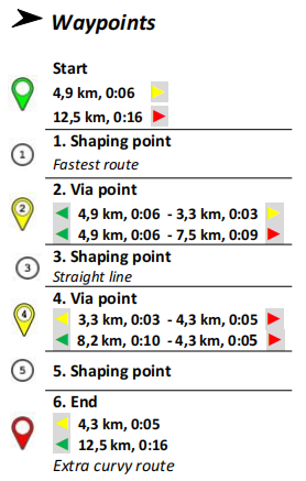
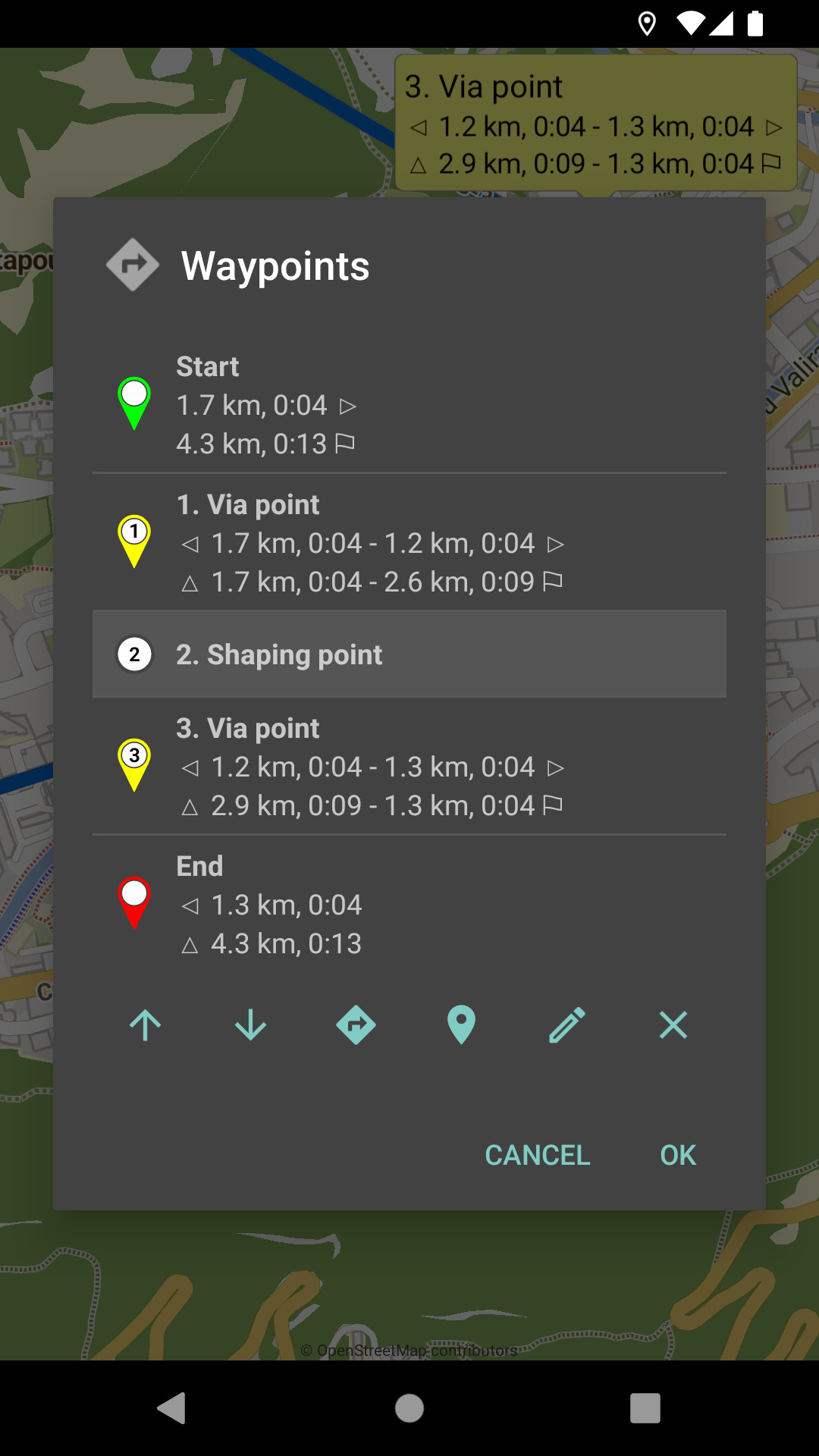
I like version #3. I think that for people who rarely look at this list, these little icons make it easy to understand these values. Of course, they are not necessary, but their absence means that you need to spend a moment analyzing what you see.
3 Likes
I answered above that they do not work correctly everywhere:
If you like it, we can use version #3.
Or do nothing and if you find better - simple, not emoji - characters in the unicode table,
we can try them.