Mark (special) waypoints with different colors to improve the waypoints overview on the map.
I suppot it, too.
All waypoints currently have the same shape (symbol) (i call it symbol A in this post). Symbol and color are features of different waypoint types (and/or stops). Nevertheless i take the post in the waypoint color topic.
But different colors are used. To this point additional notes.
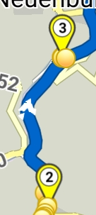
At the current type there are used different colors for via points in app and web. In app they are yellow, in website they are blue (see screenshots).
In the docu there is
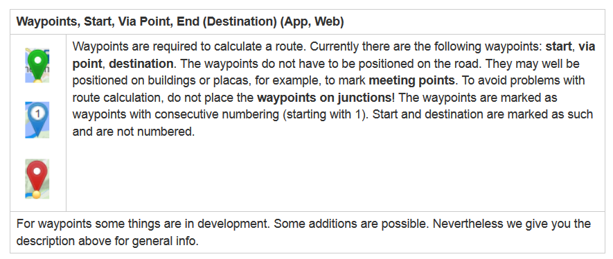
Currently we have 3 standard waypoints:
Start point (symbol A, green)
End point (symbol A, red)
Via point (symbol A, yellow in app, blue in website)
For future (announced in forum or beta):
Shaping points
When i remember correctly as color yellow was mentioned in the forum (above mentioned not be colored, how to recognize then?). I don’t know the symbol of the point.)
For future (proposals from users):
Different colors (and/or symbols) selectable from the user for different stops (Fuel, Eat/Drink, Parking, …).
To keep it simple not to mutch colors should be selectable. Due to the (in near time) available individual waypoint names we don’t need so much selectable (customized) colors.
The colors (and symbols) should be identically in app and website for the same type and stop.
Then you can avoid missunderstandings at the users. It is easier to keep some points identical in the docu.
The content above is posted in the App: waypoint colors too.
2 Likes
Thanks for the proposal, yes this could be added at some point to the website. Let’s first focus on waypoint names ![]() .
.
Afterwards things like color / symbol could be configurable. But, I also think we shouldn’t go too crazy and add millions of options that afterwards almost nobody will use ![]() . For example do we need to be able to define the color per waypoint or is it enough to change the color for all waypoints globally.
. For example do we need to be able to define the color per waypoint or is it enough to change the color for all waypoints globally.
![]()
What do you mean?
The idea is if we’ll allow changing color (like name) of each via point separately (not shaping points).
That’s one way of implementing this feature ![]() . It could be per waypoint or globally for all waypoints.
. It could be per waypoint or globally for all waypoints.
I am still a bit unsure if this should be done globally for all waypoints (not shaping points) or if there is the need to actually do this on a per waypoint base?
I think @WalterG has a good point talking about different symbols as well. Maybe it could be better to only allow few different symbols but keep the color for waypoints consistent?
What would be the user need? Maybe everyone could talk a bit more about how you intent to use this feature? One use case that I can see is to mark for example a fuel stop, or an accommodation, a restaurant, etc.
For this symbols seem to be easier to understand.
For example if I plan a route and share it with someone else, the other person could understand the meaning of the waypoint from the symbol, but colors could mean anything?
Waypoint colors feature has specific origin from a former discussion:
Change waypoint colors / symbols globally has meaning for one specific platform.
It is like route colors in app. It must not be transferable, but stored in web settings.
So if all mean waypoint colors globally, you can continue discussion for website.
That is if users want for the website to choose among symbols for all waypoints.
App will not support global symbol changes, I could only think as discussed here.
I removed app’s waypoint colors topic from new features, as there is no common view on it.
I vehemently agree!
Yes, I know that discussion, but I am not sure about the use case, so I am wondering, who would actually use it and why.
@WalterG made a nice proposal regarding symbols. I haven’t thought about waypoint symbols before, so I think it’s worth discussing.
So I think it’s worth to discuss if colors / symbols should be changeable per waypoint and if people would actually use it, considering that it’s quite a bit of extra work while planning a route.
For example I wouldn’t bother to set colors or symbols, but everyone is different, so we should collect opinions. @ninloot and @SchlesiM talked about colors in the waypoint names topic, maybe you could provide a bit more insight about your way of planning?
For me it seems there are some missunderstandings.
It is difficult to understand the relationship between waypoint types, colours and symbols (or markers) as a whole if these things are only dealt with individual topics. The separated topics are an advantage for the developers to make hooks behind ready topics. But they are difficult to the forum users to understand and to make statements to the waypoints.
Currently the app is introducing user-defined waypoint names and shaping points (pass through points).
In the web page, favorites for placemarks have been introduced, and for the app is planned to include revised bookmarks (preferably with the same terms in the app and web page).
If these things are available in both the app and the website, some of the suggestions made earlier will become less important. In some cases, they may even no longer be necessary.
That’s a big step and gain for Kurviger and the users! A BIG THANK YOU to the developers for the work!
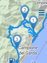
In the app 1.13 beta at the route there are following waypoints (start, via point or stopover, shaping point, end) for routing


![]()

and turning points for navigation

That’s to give an impression of the colors and symbols of the points included in the route in the app.
An example of a waypoint list with standard names of the waypoints, partly renamened waypoints, standard colors (and symbols) of the waypoints on route, and perhabs different colored renamed via points (stopovers) on route:
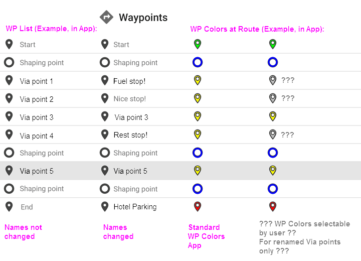
In the app standard color for via points is yellow, in web page it is blue. Why this color is different? In the picture above for the symbols in gray with question marks there were asked formerly selectable colors (and/or symbols).
But are these different colors and/or symbols still really necessary? How to handle these colors and symbols when exchanging gpx-files or other formats?
When we want to keep things simple, now i think we don’t need it. We will have less via points because we can use shaping points for routing on personallly preferred route sections. For the less stopovers we will have the user-defined names, which we can see in navigation panels (and waypoint popups and/or waypoint list). And we have favorites with different symbols.
And probably it’s better for the users to use same colors and symbols for each kind of waypoints in app and web page.
2 Likes
Because they were developed by different people for different platforms at different time periods.
App uses (much older) Cruiser platform, as old as Android and always used green / yellow / red.
Indeed, there are no type or color standards in those formats, only custom extensions.
![]()
I’m looking for a way to know what a waypoint is for. Is it a gas stop, a landmark, a meeting location? While I think a named waypoint is idea for that, if I only had a waypoint color that I could set I would use that to create a scheme that maps a color to a type of stop.
I do like the idea that WalterG has suggested, again, if actual names can’t be assigned.
1 Like