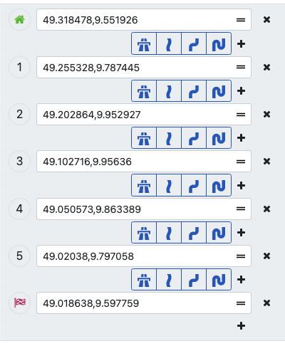
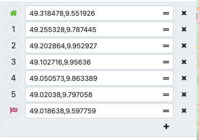
I’d really like a (even more) compact list very much.
I am planning my routes exclusively by hand, so there are very often 50 - 100 shaping- and waypoints. The buttons between every point are making such a long list really confusing and long.
I think, the link is a few posts too late and the linked post describes an other topic.
The discussion about waypoint list starts already here (or even before).
@boldtrn : If you agree, you could change your link and delete this post - or if you give a like I change the link and delete my post myself …
Ah yes, that was indeed the wrong link, thanks. I updated the link.
The width of the left panel as it is right now is needed. It might be possible to squeeze a few pixels by reducing the font size, but overall, there is not much to reduce. It’s not only about the waypoint list, the sidebar contains all the content like import, export, cloud, pois etc.
Most issues reported in regards to the left panel width seem to happen when the os starts to scale the content (like mobile versions). When reducing the size of the left panel users that don’t have a scaled version would see issues. So maybe there is a way to improve the behaviour for these cases.
There have been a few reasons why the design was chosen as it is now. If you would like to discuss a redesign of the waypoint list, please create a new topic. This would be serious change and nothing that could be offered on short notice.
The change proposed in this topic can be added now, so it would help on the short term and then we can see how we can improve the usability in the long term.
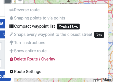
You can add a waypoint in a route segment by right click / long tap on that route segment on the map → set as via / Shaping point.
Afterwards drag the waypoint to the desired position.
That was not my intention - I just wanted to show a workaround. Separate insert buttons might be more comfortable / need less clicks / taps.
But might be also a large implementation effort for @boldtrn .


 , thanks for the implementation.
 - For new features like a redesign of the waypoint list, please create a new topic