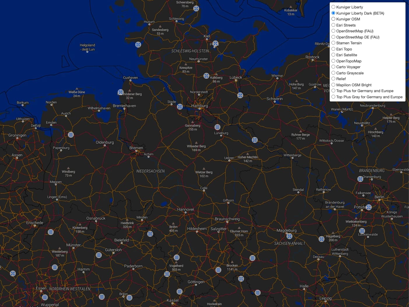
We just added Kurviger Liberty Dark, a dark version of Kurviger Liberty. This is considered BETA, so if you see any issues with this, please let us know.
Dark map styles can’t contain as much information and details as lighter styles as a lot of colours are simply not available, so we reduced the information visible on the map style to the essential information.
Nowadays, many people like to use dark themes of a website (so the background is dark, and the text is white). Currently, the website has no dark theme yet. So this is a first step towards that. So when you use Kurviger in a dark surrounding / room, it might be easier on the eyes. See also the topic I linked above for some more background.
The other thing where this map style might come in handy is if you would be navigating with a navigation app. Some apps switch the map style automatically if you enter a tunnel or if it’s getting dark outside.
For now it is simply a new map style that can be used if you like it .
Nothing wrong with another option. When I’m sitting in bed late at night on my laptop, planning my next epic ride, my wife won’t be annoyed by the bright glare.
And with the relationship between Kurviger website and the coming app perhaps for some people it could be a nice map view in the app at dark environment.
I just had a look at the new map style. For planning on the PC, it is too confusing for me, or shows me too little detail.
In the app, however, I could very well imagine the map style for pure navigation.