Could you please make the size of the shaping points and maybe the waypoints too (they are also too small when the symbols size is increased) make bigger, either depending on the route width or on the symbol width AND additionally bring them to the front. To my point of view the turning points should be in the background of the waypoints, not the other way round.
By the way: why then not also increase the buttons and the distance between them with a size slider? This then also solves the other issue with the smartphone holder.
Because they are 2 separate topics discussing different things: app buttons and route appearance.
And the obvious solution is to keep pushing the request to other topics…
Please read the topics more carefully, I have already answered:
Do you really expect developers to respond immediately without investing time in carefully examining what is possible?
Other users have tried similar push methods and in addition were also disrespectful in their requests. The result was that the community flagged their posts and the topics were moved from new features back to the general discussion for further evaluation.
Denny had explained the reasons of Motoplaner shutdown, unfortunately nothing has changed…
Of course not, I have really missed that “I will think what could be done.” Sorry. I wonder anyway how you do it, quick responding to all sorts of topics and in parallel developing without any significant errors.
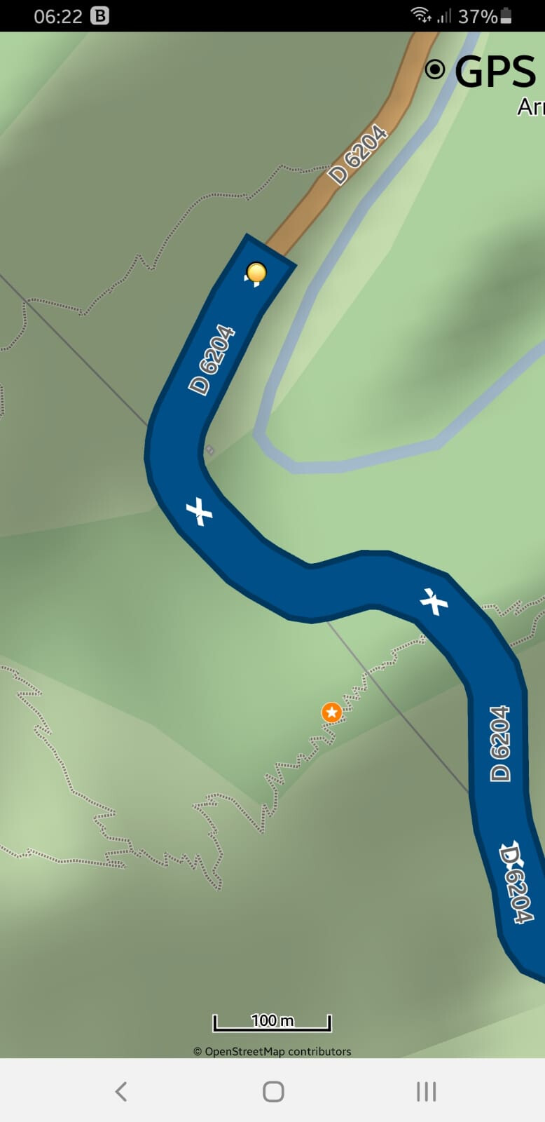
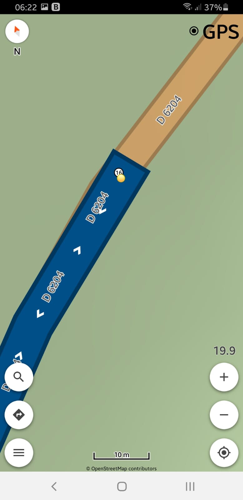
ok recognzized, but I still have the problem that the turn points are overlaying the shaping points with the consequence that I deactivate turning points even if I would like to active them. I would prefer if it is the other way round. The shaping points and way points should overlay the turn points. This makes it much easier to quickly identify the shaping and way points and press and move them if necessary.
No, too many states will complicate the maintenance.
Other users need them in planning and not navigation. It is already difficult to maintain existing nodes option.
I mentioned the solution, if you all agree, I can change the icon.
(Or even to delete a planner point if an unexpected U-turn result indicates you a trackglitch created by a not correctly positioned near to junction planner point)
It would be quite an improvement if planner points when the instruction points are displayed still could be accurately selected even when points do (partly) overlap.
A rare corner case is a snapped to street Shaping Point that is exactly covered by a U-turn instruction Icon. It would be nice when you click on a position again to toggle switch from instruction to planner point and vice versa.
See this alternative selection suggestion in the video.
(Actually I needed four record attempts for this) Point toggle selector Observe the text field color does not correspond with the white colored dot Icon.
I always disable the yellow instruction points… I don’t know what they are good for.
I am using only the via/shaping Points, In exceptional cases also a waypoint.
waypoints I have as POI.
I personally turn them off too, except for forum video demos usually not. The suggestion is intended for those users who would like to display the instruction points and have a problem when they want to select the functional planner waypoints. I thought it could be a bit more optimal for them. That’s all folks