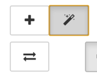
After toggling the buttons in advanced options, it is difficult (or not possible) to see the status, because the button stays the active element afterwards.
I saw this effect with Google Chrome App 86.0.4240.198 on Android 7. I am logged in as a “Kurviger Tourer”.
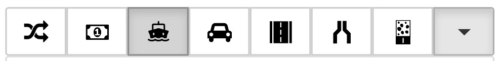
Ferry on:
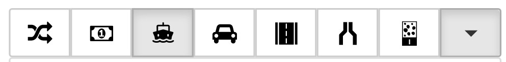
Ferry off:
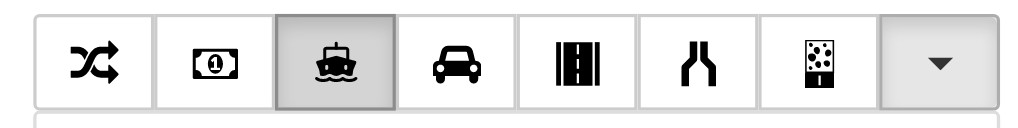
Ferry off after clicking on another button (“Place WPs on route”):
Therefore I propose to remove focus from the buttons ofter clicking / tapping ( element.blur() ).
Using Chrome on my Laptop this effect does not exist - the button toggles between white and grey without the need to click on an other button.
Thanks for the hints. I just deployed an improvement for this (should be live in 10 minutes or so). Let me know if this fixes the situation or if you are still seeing issues?
Hmmmm - perhaps the order in my previous post is not optimal.
Comparing “Ferry on” with “Ferry off”, both directly after tapping button, I still can not see a difference
I checked kurviger.de with Opera and Firefox on Android: With Opera the behaviour is the same as in Chrome: I can not see the Option state until tapping somewhere else, with Firefox I can see a slight difference.
------------------- style --------------------------------
.btn-default.active.focus, .btn-default.active:focus, .btn-default.active:hover, .btn-default:active.focus, .btn-default:active:focus, .btn-default:active:hover, .open>.btn-default.dropdown-toggle.focus, .open>.btn-default.dropdown-toggle:focus, .open>.btn-default.dropdown-toggle:hover {
color: #333;
background-color: #d4d4d4;
border-color: #8c8c8c;
}
The selector matches due to “.btn-default:active:hover” - with chrome on touch devices the pseudo classes :active" and “:hover” seem to stay valid also after tapping.
The selector matches due to “.btn-default:active” - with chrome on touch devices the pseudo classes :active" and “:hover” seem to stay valid also after tapping.
The selector matches due to “.btn-default:hover” - with chrome on touch devices the pseudo classes :active" and “:hover” seem to stay valid also after tapping.
Remark: It is a little bit confusing: There is a class “active” (selector: .active), which is used to determine if the option is enabled or not, and the pseudo class “active” (selector: :active) which selects an active HTML element - at the beginning I mixed it up.
From my point of view it would be useful to remove the “:active” selectors because I see no real benefit of a different button style during click even on PC / Mac etc…
And the hover selector should be used only for “not-touch-devices” - as far as I understand on touch devices the :hover selector is useless anyway.
Last remark: My previous proposal to use the blur() function seems not to work: Neither entering “document.getElementById(‘avoid_ferries’).blur()” nor entering “document.activeElement.blur()” in the developer console removed the grey background - the focus was removed, but the blur() function had no impact on the :hover selection …
While for Kurviger some these pseudo classes are not that important, they are very important in general. Especially when using screen readers or keyboard navigation. One example can be found here: http://outlinenone.com/ there are different issues when you start to mess with default browser behavior - most things are there for a reason
Of course I do not deny the sense of the pseoudo classes in general!
But from my point of view the benefit of the pseudo class :active is small, even on a pointing device: It is used to change the look of an element during click on it on a - after releasing mouse button that look disappears again (different to pseudo class :focus, which selects the element in focus - useful for keyboard navigation on a website. Sorry for choosing confusing thread heading, at the beginning I thought that the focus was the reason). But it seems that with Opera and Chrome on touch device the pseudo class :active stays valid even after removing finger from screen
And the :hover class can not work on a touch device, because there is no pointer which can be moved over an element (as also described in the link from you above) - so it could be separated via a media query “@media (pointer: fine)” to prevent the behaviour of Chrome and Opera on touch devices (from my point of view the behaviour of Opera and Chrome is wrong - but I see nearly no chance to change that).
Yes, but there isn’t much I can do to change browser behavior, without some serious intrusions that could lead to other issues . So I am not sure if we should go down that road.
 ?
?
 . So I am not sure if we should go down that road.