Why can’t I answer to this topic and how can I take back my vote for this new design? How can I vote to dislike this ?
In menus, settings or options I don’t care, I don’t see them too often. But navigation bars and text I see all the time while driving and for me this just black plain font with transparent and non-shadowed square is best readable to me, as linux-user also already mentioned. This was also my preferred setting in Kurviger 1 Pro, simple unobtrusive font and navigation bars which I liked a lot.
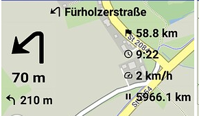
The new “forced shadow design” gives me eye cancer. I really hate it.
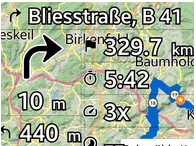
Kurviger’s strength was to offer highly customizable GUI design. Now you are gifted with a forced shadow that spoils any fun of driving. Why do you want to make your app boring like others? This is my opinon, no offense.
You make such a good app, now it is optically disfigured to my point of view. How difficult can it be to allow again the simple display for navigation bars and font (only during navigation)?