App: Navigation actions menu

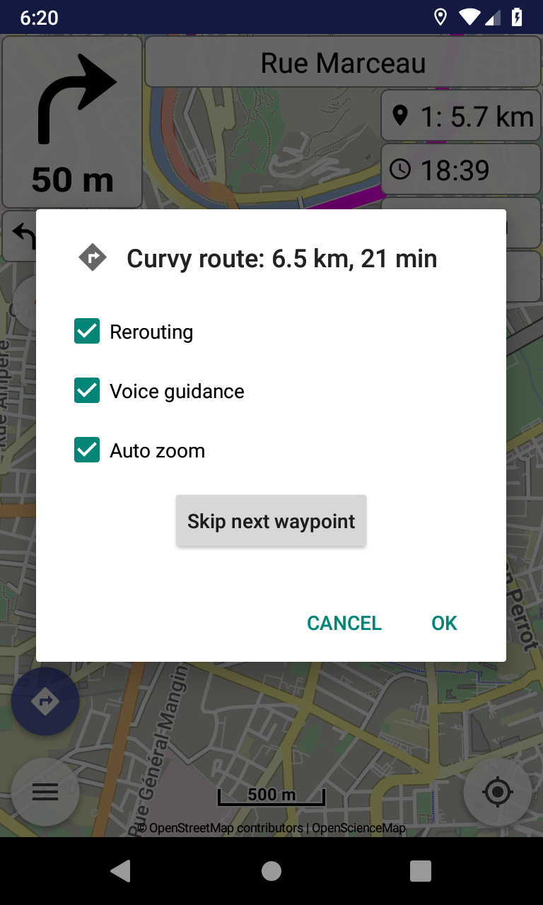
Let’s see what can get in that dialog. :slightly_smiling_face:
We certainly discuss all user ideas here!

Such clear route action, stops navigation and removes the route from map, without questions.
Alternatives would be use navigation button and clear route in various places (e.g. left menu).

Regarding the design of “Skip next waypoint” entry, don’t have strong opinions, but if asked:

a) “Action” (immediate response of app) or “Decision” (needs a second tap to confirm?
-> Decision: It needs one more tap, but enables control and revision if decision was made by mistake;
skipping a waypoint by accident (and perhaps not noticed) may cause much irritation, and the decision to skip next waypoint is nothing you do frequently, so one more necessary tap should not be a strong argument against.

b) Check box (set a check mark) or check line?
-> Check box: Check boxes are more consistent with all over design of app? Or planned to revise design in general?

That’s why my preference remains the above suggestion with all being check boxes.

My 2nd preference is with being one click buttons (seen above) like in route actions.

And need to consider that more actions will come, so interface needs UI consistency.

I also think it should be: buttons for actions (like “skip next waypoint”), check boxes for settings/options (like “rerouting”).

As justified before I would support THIS way …

Note that all can be considered actions (e.g. disable rerouting) and all being options if want to provide extra security check via OK.

Thing is that mixing different controls in a (small) mobile interface can produce alien results… :slightly_smiling_face:

Until find a more universal solution, can continue with following in portrait / landscape:

2 Likes

You can think in this way:

  • If you need to store the state, than it is probably an option (=> check box)
  • If it is a one time action with no state being stored, than it is probably an action (=> button)

Manfred

1 Like

I think this option is not ideal, because people have to read the on and off state of the button and cannot use checkboxes. People are used to checkboxes for these things.

I think this would be my favorite approach for now :heart_eyes:. We can always improve it :slight_smile:

1 Like

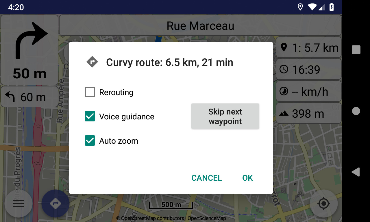
Had a nice cruise today - and tested the “Skip next waypoint” option.

Hmm: There IS a risk that you tap the “action box” by mistake when you are moving and want to click one of the check boxes while moving - I guess much more on a moving bike and with gloves …

So a confirmation by a check box still better solution?

(Just as a hint.)

1 Like

Well I expressed my preference, we can finally have what you most prefer. :slightly_smiling_face:

EDIT: I see it more as usability, than classification of actions vs options.

1 Like

Kurviger 1.4.2 was released with enhanced navigation menu.

1 Like

Anyone there who would enjoy to draft an update for the Kurviger documentation to this feature?

(As I mentioned here: We need help! - Wir brauchen Hilfe! …)


Gibt es jemanden, der gerne eine Aktualisierung der Kurviger-Dokumentation zu diesem Feature entwerfen möchte?

(Wie ich bereits erwähnt habe: We need help! - Wir brauchen Hilfe! …)