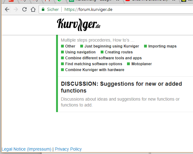
First of all the landing page is clear and concise, well done.
Here are some things I would improve:
-
When I click on “Kurviger.de” at the top I would exepct to go to Kurviger.de, not the forums (although this might be debatable). An easy fix that avoids that debate and makes it super clear at first glance would be to write “Forums” in subscript below the icon, somewhat like “prime” here:

-
The footer is next to the div#main-outlet instead of inside it, so it doesn’t move to the center on a big screen, looks kinda weird
-
The “latest” bar on the right side should be customizable and/or filterable (by tags?). Also I think it should be less wide or on a different background color for its div, so that it’s separated from the main content categories. As it is, at first glance it looks just like more categories. Maybe lowering the spacing a bit or giving the posts a more “card-like” feeling with a border or gray background would distinguish them more as posts, not categories
Cheers