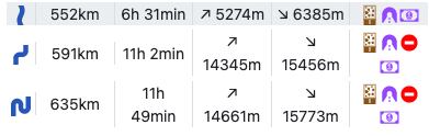
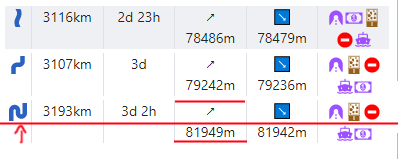
When you select “all curvy roads” there is a nice table at the bottom, which compares your routes. But if the numbers become appreciably large, the layout breaks, like so:
It looks glitchy, because of the vertical position of the first three columns. Could you set the gravity to “center” for the icon, the length and the duration?
Reproducible in Firefox and Chrome with current version at time of writing
 - I will double check and add this with the next update.