Trotz Verwendung des grünen Kurviger Icons der Version 2 bezieht sich die Beschreibung der App und der Kurviger-Screenshot (blaue Statuszeile, blauer Navi-Button) auf die Version 1.
Daran sieht man, dass durch journalistische oder redaktionelle Unzulänglichkeiten durchaus Falschmeldungen möglich sind. Meistens gibt es aber einen Link zur Kurviger-Webseite.
Um so wichtiger ist es, dass die Möglichkeiten der Verwendung der Kurviger-Webseite ohne und mit Abo, sowie der Kurviger-App ohne und mit Abo auf der Webseite ordentlich und leicht verständlich beschrieben sind.
Leider muss ich mich hier wiederholen, was mir absolut keinen Spass macht, wie das evtl. aussehen könnte:
Webseite und App könnte man jeweils evtl. grafisch noch etwas deutlicher kennzeichnen (Rahmen, Farbe).
Premium-Überschrift evtl. noch etwas abändern.
Fragen und Antworten evtl. noch etwas ergänzen.
Allein durch diese Änderungen wäre der Informationsgehalt um einiges verbessert. Die Seite kann bei Problemen als Referenz angegeben werden, um die Leute darauf Aufmerksam zu machen. Dadurch könnten einige Probleme mit den verschiedenen Abos bzw. Versionen vermieden werden.
Das ist mir auch aufgefallen, vermutlich wurde hier nicht neu recherchiert sondern Informationen aus einem alten Beitrag recycled?
Ich hab dir ja schon zugesagt, dass die Premium-Seite in Zukunft verbessert werden soll. Das ist bereits geplant, aber noch nicht umgesetzt. Bitte bedenke auch, dass du es dir mit nur einer zusätzlichen Box etwas zu leicht machst, das ganze muss auf verschiedenen Bildschirmgrößen gut funktionieren und soll auch niemanden mit Informationen erschlagen.
Ich denke mal das realisieren schon die meisten hier. Dennoch wäre es glaube ich gut, wenn du auch schonmal erwähnen könntest, ob das einigermaßen hohe prio hat
Die Sache mit den Abos wird sich v.A. Im Sommer wenn wieder mehr User kommen hier im forum wie in Kampf gegen Windmühlen anfühlen
Ich bin schon der Meinung, dass das Thema wichtig ist und es ist relativ weit oben in der Todo Liste. Allerdings sehe ich das Thema nicht kritisch, sprich keinen sofortigen Handlungsbedarf.
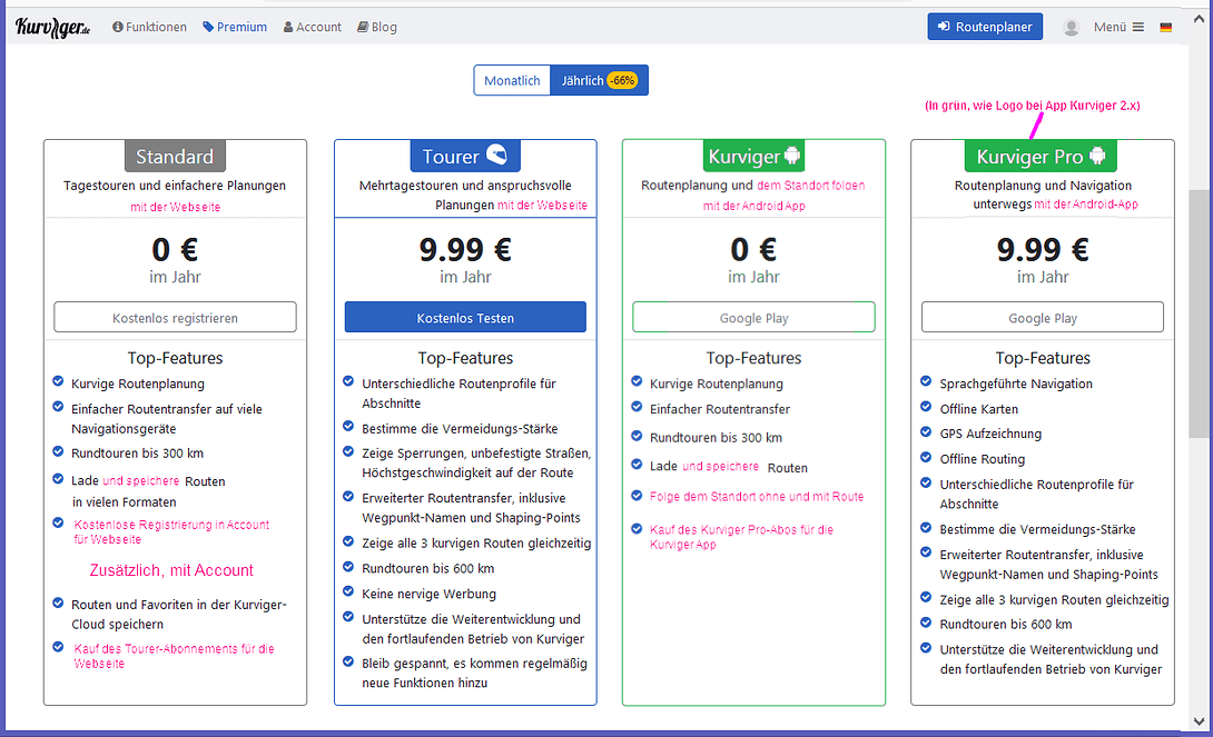
Ich finde die aktuelle Ansicht ist bereits auf einem relativ guten Niveau. Man kann mittlerweile ziemlich klar sehen, dass es 2 Abos gibt, was diese kosten, welche Funktionen diese Abos bieten, und wo diese abgeschlossen werden können.
Der Funktionsumfang der kostenlosen App bzw. der kostenlosen Webseite ist im Groben ähnlich. Daher finde ich die von @WalterG vorgeschlagene Ansicht nicht ideal.
Was man sich aus meiner Sicht überlegen könnte wäre die Tabelle “Standard” zu vereinfachen, so dass diese nur Funktionen enthält die sowohl die App als auch die Webseite betreffen.
Alternativ könnte man sich überlegen anstatt 3 Tabellen nebeneinander zu stellen, jeweils 2 x 2 Tabellen nebeneinander zu stellen. Dann könnte man jeweils eine 2er Gruppe für die Webseite und eine 2er Gruppe für die App haben. Dadurch könnte man dann etwas besser auf die Unterschiede der Platformen eingehen.
Ich bin auch offen für andere Vorschläge. Vermutlich gibt es auch noch bessere Möglichkeiten als die von mir beschriebenen Optionen?
Das mit den 2x2 Tabellen (oder besseren Möglichkeiten) klingt schon mal viel versprechend. Wenn das dann so (oder evtl. noch besser) umgesetzt wird, führt der Vorschlag mit den 4 Tabellen und den übrigen Anmerkungen doch noch zu einem wesentlich besseren Informationsgehalt der Webseite .
Ich bin unsicher, ob eine 2x2 Tabelle besser (übersichtlicher) ist, aber halte es für sinnvoll, viel deutlicher darauf hinzuweisen, daß ein Abo für die Webseite und das andere für die App ist (wie auch schon von @WalterG vorgeschlagen), denn hier entstanden viele Mißverständnisse.
Z.B. durch eine Überschrift “App” und “Webseite” über den Tabellen.
M. E. müssen wir uns alle ganz fest an einer stringenten Namensvergabe halten, z. B. sollte “Kurviger Pro” nicht für das neue (2.0) Abo benutzt werden, sondern nur noch für die 1er Version.
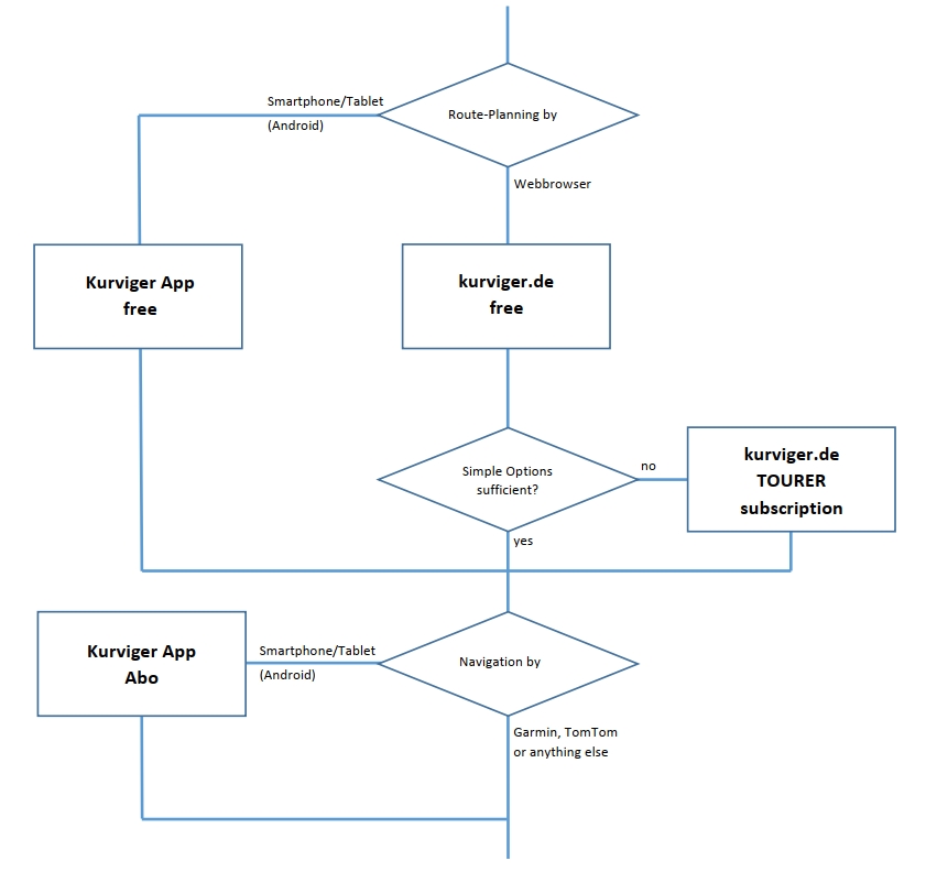
Es gibt unterschiedliche Nutzerprofile (Planung wie / Navigation womit) - ich weiß: eine Binsenweisheit, aber bei manchen Anfragen hier im Forum habe ich den Eindruck, dass die Leute einen “Leitfaden” bräuchten. Damit könnten sie erkennen, welches der “vier verschiedenen Produkte” sie benötigen.
Ich hab’ mal aus lauter Langeweile ein Flowchart gezeichnet:
Now we have a nice discussion how to improve on the website the description of the Kurviger world or universum (website without/with subscription, app without/with subscription).
Perhaps for the discussion of description/promotion of the Kurviger world and the names of app versions 1 and 2 a new topic should be created. I don’t know in which category this should be created. Perhaps one of the developers can create it.
New ideas and feedback to improve this part of the website is welcome.
This discussion currently exists because various things are not well communicated or described both in the website and in the app.
Renaming the app version 1 or version 2 also brings uncertainty again with one or the other user of the app! Questions would continue to arise. Therefore, the communication/description in the website and app should be improved.
What is the difference between “Pro” in App Version 1 and Version 2?
In Version 1 the Pro features were/are usable in a separate app (Kurviger Pro).
With Version 2 the Pro features in the app Kurviger are only usable if the subscription is active.
This should be described more clearly in the app and the website! Then you could consider the following in the names of the apps:
Version 1 could keep the name Kurviger Pro and version 2 could keep the name Kurviger.
For version 2, the subscription could be highlighted by adding (Pro). The Pro should be put in brackets, as is currently the case in the app for the selectable Pro features in the Free version. Perhaps the name Kurviger could be printed in bold, the addition (Pro) in normal strength, looking like “Kurviger (Pro)”.
So “Kurviger” and “Kurviger (Pro)” could be the only change in the names and distinctions of the app version 2 without/with subscription.
So far the idea, what could be considered for the designations or the names of the apps. Ideas to revise the communication or description in the app and website will follow in further posts.
For description we should remember that the Kurviger world or universum not only is website and app. Documentation (Kurviger wiki) is an additional part of the Kurviger universum. And this part has to be maintained too when there are made changes in website or app. Documentation should not be neglected. But basic info must be in website and app!
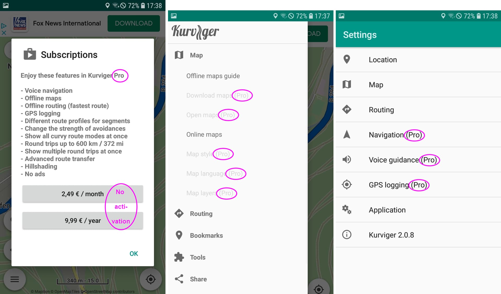
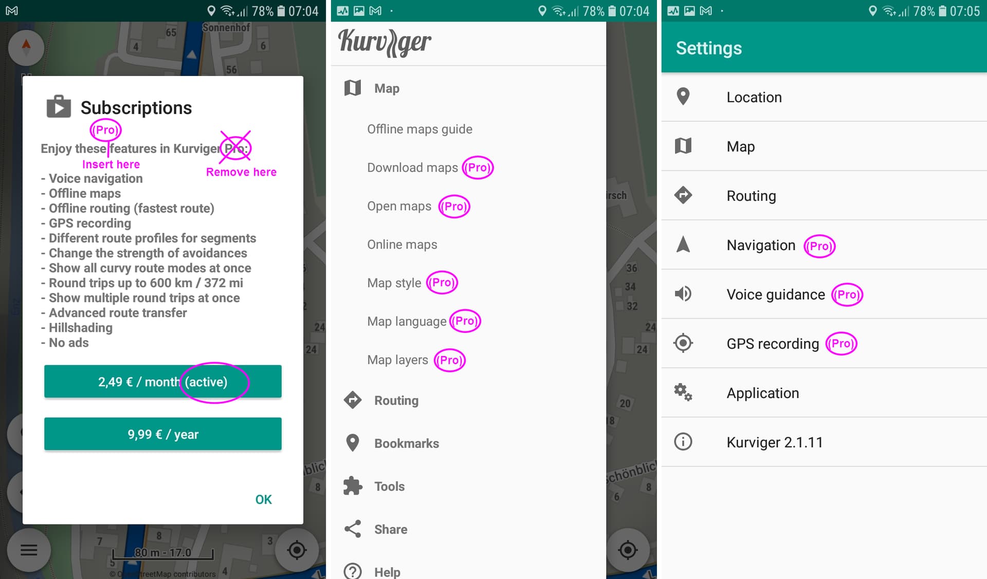
Here an idea to revise communication/description/text in the app. Examples with screenshots without subscription version 2.0.8 and with subscription version 2.1.11.
Without subscription, where you have hints to Pro:
Only little work needed to replace the name Kurviger Pro by only Kurviger and to give a hint to the (Pro) features.
When with activated subscription the (Pro) in the menus and dialogs (examples for map options and settings) is not removed the user always is aware when he wants to use or is using (Pro) features in the Kurviger app.
With these two measures the (Pro) is more obvious.
When needed more info, this can be delivered in Google Play, website and/or documentation.
When decisions for changes in app are fixed then we can discus how to improve text in website.
About the old app, it is in maintenance mode and all new users will not even know it existed.
Note: the Pro indicators also exist in map settings and inside all Pro settings.
Pro indicator is needed to show what features are hidden and available only in subscription.
When the subscription is active, there is no reason to annoy users with additional indicators.
The app is fully functional with all features activated.
There you are absolutely right . Therefore it should not be necessary to change the name. And it is not necessary to mention it in the website.
The only way to mention it is in the documentation to describe how you can reinstall it e.g. on a new device. Currently this is described in the manual in the section App Kurviger, Subscription, Upgrade.
I know. The screenshots don’t say that are all things with the indicator. They are only examples to show in which way it is handled currently.
I thought, that this was/is your intention to remove the (Pro) indicators when subscription is active. But as we can see some users have problems with the Pro term, when they don’t see the Pro. Therefore my proposal not to remove it with activated subscription too.
With activated subscription the Pro term in the app currently is only visible in the Subscription dialog (see screenshots). And there it can be read as Kurviger Pro even a Kurviger Pro app is not existing in version 2.
Even in the About dialog it is mentioned as Kurviger, not as Kurviger Pro. Therefore my proposal in the Subscription dialog to change the text “Enjoy these features in Kurviger Pro:” to “Enjoy these Pro features in Kurviger:”. Perhaps you can put the Pro in brackets. Of course this change is not only necessary in EN, it is necessary in the other languages too.
So we can try to avoid irritations at some users. In my opinion it is worth to do it.
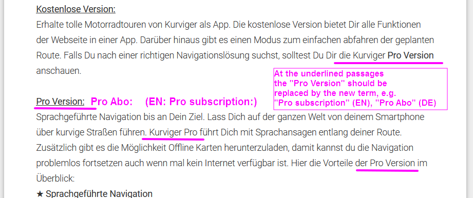
When the term “Pro subscription” (EN) is fixed in App and Website then in Google Play the term “Pro Version” (DE) and “Kurviger Pro” should be replaced by “Pro Abo” (DE), “Pro subscription” (EN).
Don’t know how different languages are handled in Google Play. But for other languages the term should be changed too.
There are too many languages, so it is better not to change texts constantly.
Now that I think about it, the app probably does not need to change either.