hello,
I’ve got over 700 bookmarks on my old kurviger app. in the new app, like the web-version, only 300 can be stored per favorite folder. I split the file in 3 parts, imported them in 3 different favorit files, but I cannot show all 3 together on the map. Sadly enough my bookmarks are not sorted per region. Doing this would be to cumbersome. Or am I missing something?
thanks
kind regards
luc
1 Like
Right now the number of favorites is limited, this is something we have on our todo list to check and increase.
5 Likes
Thanks, that would be fine.
Additionally another question. Is it possible to “load” the favorites of one folder directly in one tour. To activate them and say “make a route ouf of this”.
Ich kanns einfach nicht in Englisch: also die Frage ist, ob man die Favoriten aus einem Ortner zB. als Massenverarbeitung markieren könnte und sie mit einem Klick in eine Route packen, im Sinne von “mache mir eine Route daraus”.
Geht sowas und ich habe es nur nicht gefunden?
Danke juschka
P.S. Achso per se auch auf der Webseite, bzw. dann später auch in der App (ist ja dann die gleiche Datenbasis wie ich verstanden habe).
1 Like
Favorites don’t have any order, so we could create a random route from this. Creating a route that makes sense is really complicated.
Finding the optimal route in this case is called the travelling salesman problem, a famous problem in computer science.
You can click on favorites and add them to a route, but right now there is no way to do this automatically.
3 Likes
My main point is, that I have to add each favorite one after the other to put them in the route.
If there is actually no process, I don’t know → you actually have to click the first favoriie in your list, activate as waypoint, then change to next favorite, activate as waypoint, change to the next favorite, activate as waypoint…and so on. I have up to 200 favorites in one folder.
To be able to mark several favorites in one step on a list and then activate them in one process would be fine. It’s easier, if the favorites would be “active” in the route and then to push them manually to a senseful route, if you have the overview in the map. (That’s normal to do this, if you’re planning a route and then thinking about optimisation and change the waypoints in a new order).
BR juschka
If you want to create a route of your favorites, you can export a favorites folder to a gpx.
Than you can Import that gpx into a route.
But the resulting route may look strange because of the random order of the waypoints.
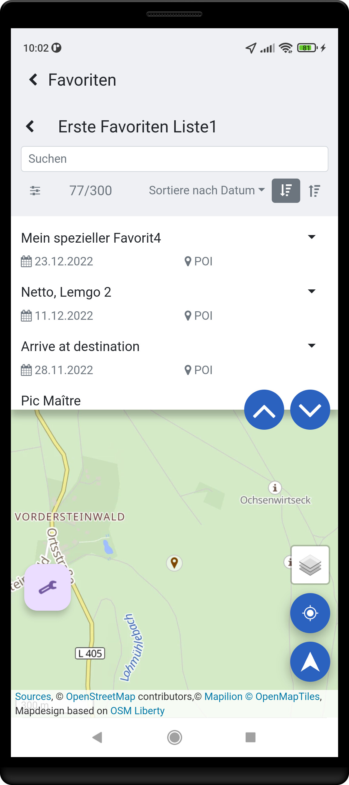
Hi, could it be you’re planning on the web? I plan on the app, and all bookmarks are visible on the map. I let kurviger create the route (very curvy). The I select a few favourites which i really want and set them as waypoint. Automatically a number of other favourites are in the new route.
When you have 200 favourites in one region and want to make a day tour out of it then selecting a few of them as waypoint will include the others in my opinion. If not i doubt you’ll be able to ride all those waypoints in one day
No the waypoints in the folder, the favorites, are e.g. not for a day, but for a holiday. Therefore the route is quite long and for sure with some optimisations it’s the fasted first to collect interesting things and then later to combine them to a route…
Thanks for this, but could you please explain how to export the favorites? If I’m clicking in the cloud on the favorite folder (right click - only normal windows menu, nothing for download).
How can I download the complete folder?
Additionally the question: if I have to export via GPX, then all names of the favorites are lost, correct?
Thanks
Best regards
juschka
No, all names are preserved - test it.
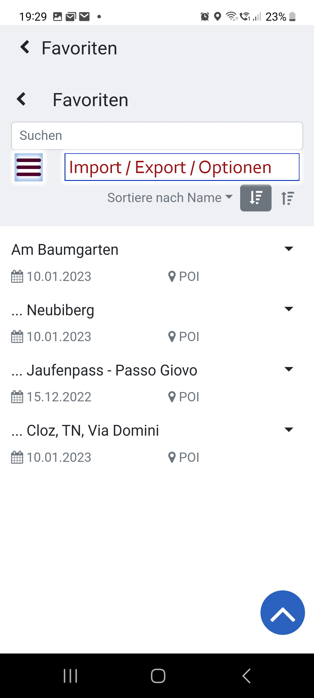
Thanks, I’ve never clicked to that “D”, didn’t see that there is any action behind.
It was for me a signal for the sorting option as in MS Office.
Ok, thanks, then I’m trying this option and waiting & hoping for a faster / easier way for activating the favorites directly in a route.
BR juschka
Der Click Bottom “Advanced Options” ist dort aber gut versteckt! selbst wenn man die Beschreibung oben 3x liest, dann sucht man immer noch danach. Also etwas auffälliger könnte man den da schon machen. Ich erinnere gerne an die “Nutella-Regel”: Nur wo Nutella draufsteht, ist auch Nutella drin - bzw. bei den Click Bottom dahinter . . . ![]() . . . Ihr habt da ja generell ein “Nutella-Problem” . . . macht doch an diesen Stellen eine farbige Click Box mit Klartext, Platz ist doch da. Die drei Stricher’l dort - das sagt einem doch garnix. Jetzt weiß man das zwar, aber in drei Monaten ist’s vergessen . . . wetten! (wird schon noch, bin auf jedes Update gespannt
. . . Ihr habt da ja generell ein “Nutella-Problem” . . . macht doch an diesen Stellen eine farbige Click Box mit Klartext, Platz ist doch da. Die drei Stricher’l dort - das sagt einem doch garnix. Jetzt weiß man das zwar, aber in drei Monaten ist’s vergessen . . . wetten! (wird schon noch, bin auf jedes Update gespannt ![]() )
)
1 Like
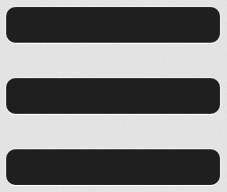
Fachjargon für die drei Stricherl ist übrigens “Burger”. Gibt’s inzwischen in fast jeder App.
2 Likes
Und Burger heisst dann immer “Import” “Export”?
VG juschka
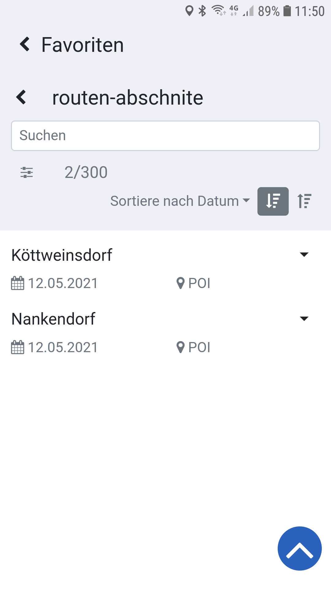
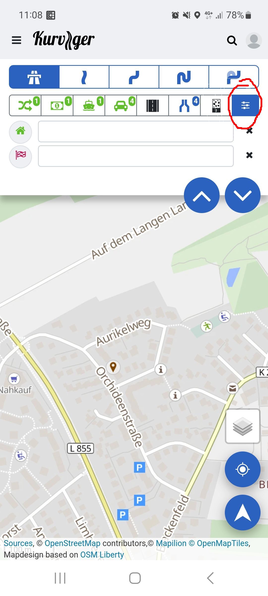
Das Burger Icon sind 3 Striche, das steht normalerweise für ein Menü. In der Mobilversion kann mit diesem Icon das seitliche Menü aufgeklappt werden.
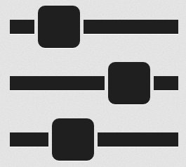
Das Icon bei den Favoriten ist kein Burger Icon, sondern ein “Settings/Options” Icon. Das sollen Schieberegler sein. Dieses Icon verwenden wir an ein paar Stellen um Einstellungen anzuzeigen, wie z.B. auch bei den Vermeidungen.
1 Like
@ Padde . . .
ich weiß . . . wenn’s aber so winzige Stricher’l sind, sind’s halt nur drei Stricher’l und kein Burger . . . ![]() Wir sind aber ned destruktiv, wollen doch, daß K3 eine tolle Lösung wird. Ich kritisier ja ned, ich sach ja nur . . . und mach ja konstruktive Vorschläge . . .
Wir sind aber ned destruktiv, wollen doch, daß K3 eine tolle Lösung wird. Ich kritisier ja ned, ich sach ja nur . . . und mach ja konstruktive Vorschläge . . .
Noch einer:
Original . . . . . . . . . . . . . . . . . . . … und mein Vorschlag:
Im Vorschlag, das ist jetzt ein “Burger” . . . und für alle, die sich unter einem Burger (oder drei Stricherl) nix vorstellen können - die Klarbox mit Text dazu, als Goody. Wie gesagt: Platz ist da . . .
Der “Burger” in der Kopfzeile von der Hauptseite ist ja auch zu klein . . . wurde schon von Anderen angemosert - und vorgeschlagen a) größer und b) kombinieren als Click Box mit dem Kurviger Logo zusammenlegen - ähnlich, wie hier.
Der Text in der Click Box Feld: “Suchen” könnte auch gerne größer sein . . . ab 40 Lenze und Fahrbrille wird’s da eng ![]()
MfG. Antonio
1 Like
Vielen Dank für den Vorschlag. Der Platz ist aber vermutlich auch nur da, weil du in deinem System eine größere Schriftgröße eingestellt hast ![]() .
.
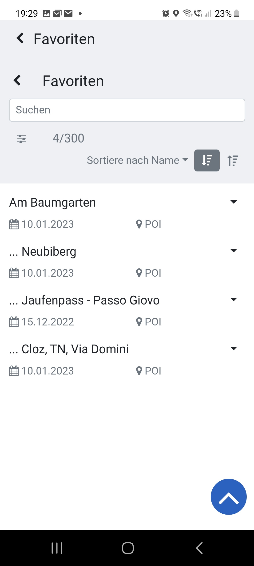
So sieht das bei mir aus:
Wenn wir jetzt für jedes Icon, einen Text an das Icon schreiben, dann sieht man in der Favoriten-Ansicht auf halber Displaygröße gar keine Favoriten mehr ![]() .
.
Der Settings-Button ist hier wirklich einfach zu übersehen, da müssen wir mal überlegen wie wir das besser darstellen können. So viel mehr Platz sollten wir in der grauen Fläche oben aber nicht verbrauchen.
Wir haben auch schon zugesagt, dass wir das Thema auf dem schirm haben. Wir werden versuchen die Klickflächen größer zu gestalten. Man muss da aber schon aufpassen, wenn man diese ganzen Elemente deutlich größer gestaltet, nimmt man am Ende wichtigen Platz für die eigentlichen Inhalte, sei es die Karte, oder die Favoriten.
Für die bessere Optik könnte ich mir vorstellen, die Darstellung von der Startseite zu übernehmen, sprich durchgängig die Blauunterlegung der Button fortführen. ![]()
Vielen Dank für den Vorschlag. Dann müssten wir aber alle Buttons mit Blau unterlegen?
Wir haben die blaue Unterlegung eigentlich nur für die wichtigsten Buttons.
Sieh an… Ihr habt die Blauunterlegung als “wichtig” erachtet und ich habe die Blauunterlegung als “drückbar” verstanden… ![]()
Indeed.
Without the explanation of @WalterG I wouldn’t have found it.
This is what it looks like on my phone, and I didn’t change the font size.