Next version will offer an improved rendering of highway numbers (shields).
An advanced rendering with different shapes or stroke will come in future. Note: highways will continue to appear as line labels at very large zooms.
We currently play with background colors, in order to make the main roads more clear to read, while simultaneously trying to not make the map too heavy.
So there are some different concepts:
White text on colored background
Black text (like now), with semi transparent light background for more clarity
Sorry, but I really always hated those shield styles cluttering my nice clear street visualization.
For my liking both examples are ugly and offer no significant improvement. In my opinion example one (green shields) looks even worse then the other one.
Like I already mentioned in another post: I always loved Kurviger’s look because it reminds me more of the good old paper map than any other navigation app. For me it would be a pity to loose that look.
Alternative colors with more contrast would be Ok. As long as the “classic” look can still be selected in the “map color” settings.
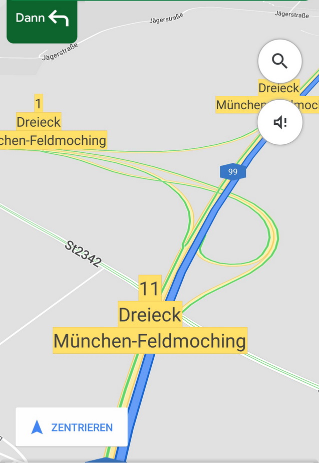
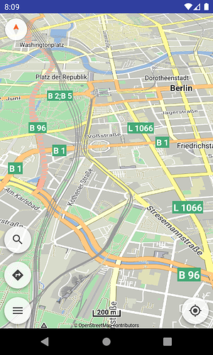
These are not highway shields (only the blue “99”).
We mean to render more clearly the highway numbers at zooms ≤ 12, not put colors in all road labels.
But I always loved that one:
See my note above: Note: highways will continue to appear as line labels at very large zooms.
Alternative colors with more contrast would be Ok. As long as the “classic” look can still be selected in the “map color” settings.
This is irrelevant to what color filters can be applied to the whole map.
The feature is already integrated, here is to select nice readable colors.
Especially with tilted and zoomed in map view while driving I’d prefer not to see those shields beause they may make small streets and crossings difficult to see.
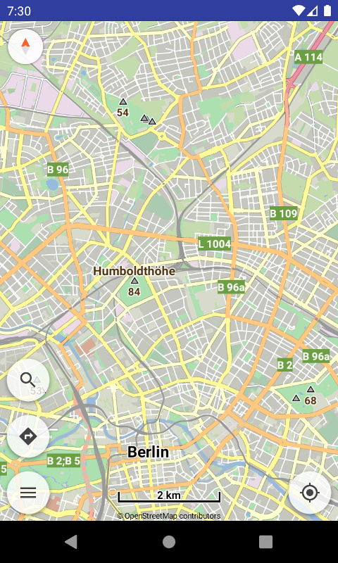
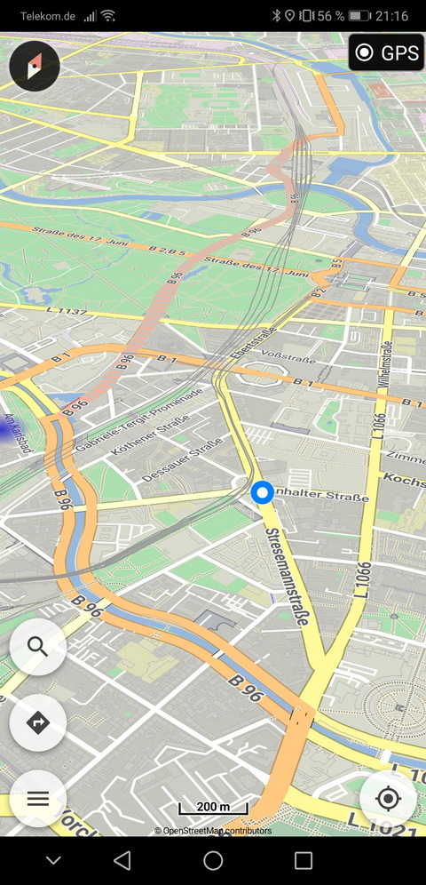
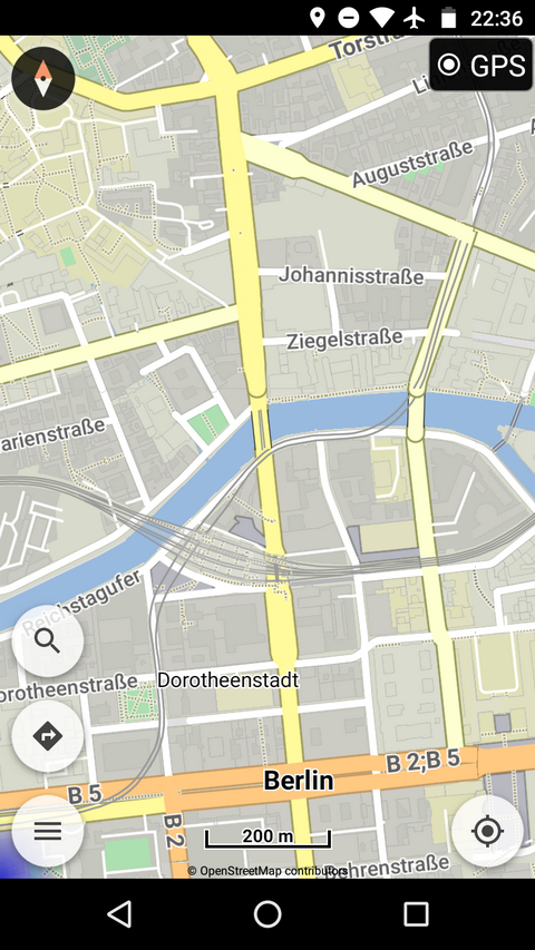
This is the look I prefer today (zoom level 15 at this moment):
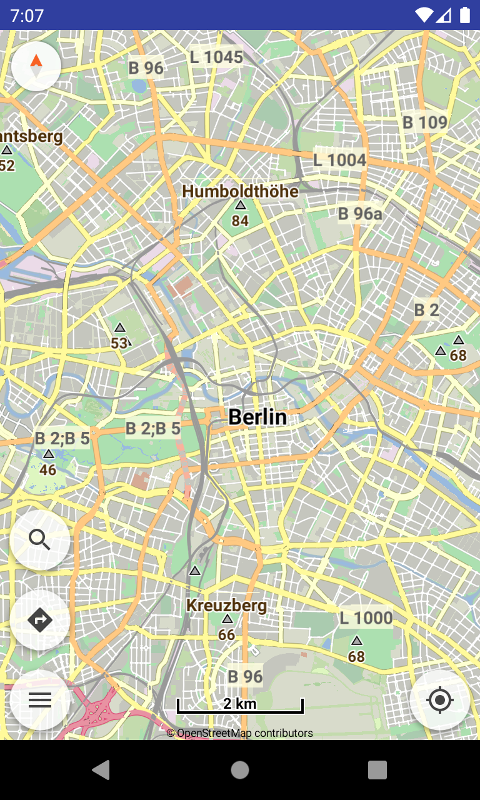
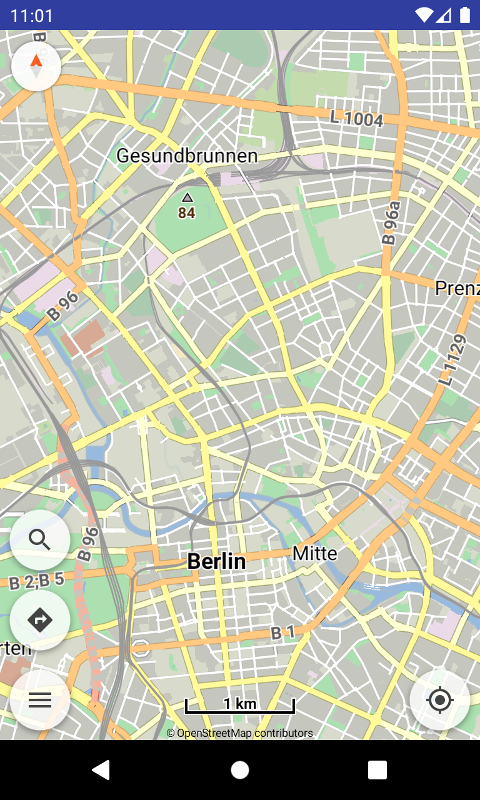
Will this really be cluttered with shields similar to this screenshot?:
Then hopefully there will be an option to switch off shields in the settings then. For me this would definitely be no improvement (BTW: I also don’t like Google Maps look concerning those elements).
Ah sorry. In fact I missed / overread that info “zooms <= 12”.
Also was a bit confused because I thought the two compared screenies are using the same zoom level.
I’m still not a fan of those shields but that might be some compromise to live with. I think we’ll have to wait and see how this change affects the use of the Kurviger app (may be different depending on the display’s size and font size setting of the smartphone).
I respect everyone’s opinion, though millions would disagree, since most / all maps have highway shields and users are accustomed to them.
I can add in layers an option to turn on/off completely the highway reference numbers.
But sorry not change their rendering.
Or else everyone would start, let’s change symbols in restaurants, fuel stations, etc. because they’re too brown, purple, etc.
If go so far as what like in current theme, I don’t like it very much (disclaimer: didn’t write it).
I consider it fat-lined, heavy and dull in the eyes, prefer much better a version of the nicer / colored Cruiser theme.
But again all those are just opinions, cannot satisfy everyone, only offer sane defaults.
No problem . Of course there’re lots of different users feedbacks and preferences - but after all only one developer’s decision.
No, you’re absolutely right. There have to be limits concerning settings and customizability. Please forget my suggestion. Completely switching off highway reference number for sure wouldn’t make sense.
Funny how different peoples’s tastes are: I really like the current theme. It’s similar to the HERE themes I use on different systems and I like the fact that it is quite compatible to the new Kurviger Liberty style on website.
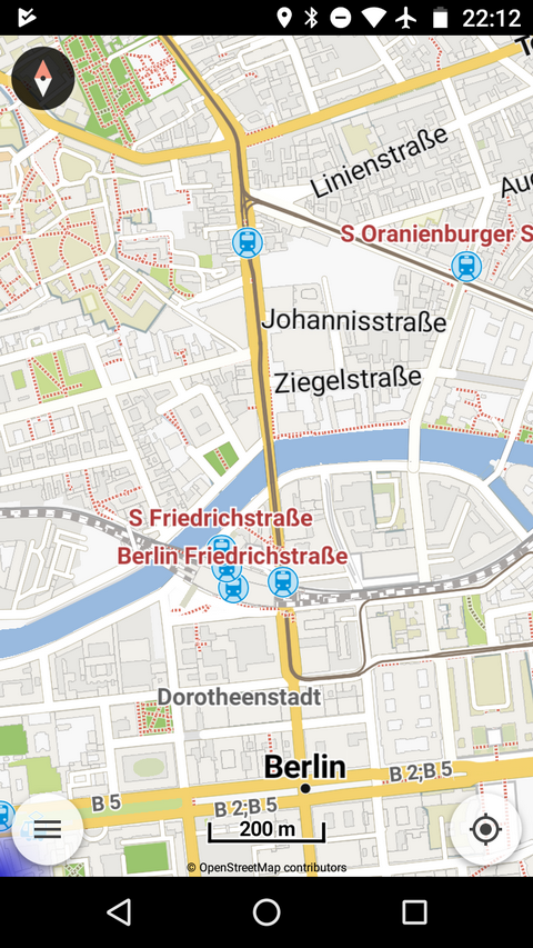
Hmmm. Just compared the same location on my good old Moto G3 shown in Cruiser (1st/left) and Kurviger (2nd/right):
I still like Kurviger’s style more. Because I like those slightly “pastel” colored styles. And (more important) because different street types can be distinguished better as they have their own color (seems like Cruiser only uses white and orange colors instead). And streets have more contrast against the ground (better to recognize while riding on a motorcycle).
Ahhh, now my pulse rate’s decreasing again . This is exactly my zoom level while being off the route (with rerouting switched off). Would be a little cluttered with all those shields.
That’s why I wrote “a version of”, not necessarily the same, as it’s purpose is more generic.
I was referring more to current fat lines everywhere which make the road details not easily distinguishable and the lack of colors which make all labels appear the same and so difficult to recognize.
Well, Google imitates the appearance of the signs as they are on the road.
Each country has a different set of colors.
E.g.
in Germany blue/white for motorways, yellow/black for primaries
in Italy green/white for motorways, blue/white for primaries.
Sounds reasonable. Google doesn’t have these shields on smaller roads either.
Will the text size be variabel? For me actually the size of the number of roads is nearly to small for reading (I have goggles ) - for me it would be fine if I could change the size for my individual possibility reading the map on the bike (ca. 50cm).