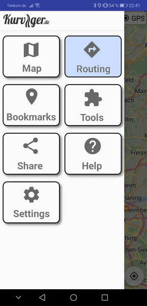
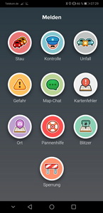
Since the Kurviger app is made to be used on motorcycles I think it would be a good idea to enhance the menu by using big buttons instead of simple lines of text.
Of course these text elements can be made bigger by changing Android’s setting (like recommended here). But this changes the whole system GUI what could be unintended.
Buttons would offer more size and recognizable symbols and therefore could be operated much more comfortably. Additionally the “all menus in one sidebar”-design could be changed to a “one sidebar for each menu topic”-design to gain more area to place the buttons (and to make the GUI a little bit more modern). Every “topic page” could have a “back”-button to return to the main menu.
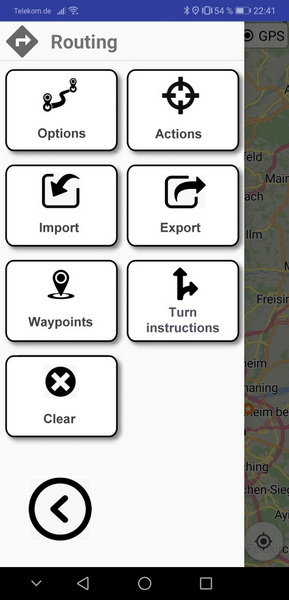
Something like this (the “Routing”-button was pressed in this scenario):
I’m absolutely aware of that. Wasn’t meant as complaint just as a suggestion.
And there’re certainly more important features to be implemented first. But maybe it would be good to have a custom UI just because Android’s UI is constantly changing. It would help to ensure that Kurviger’s UI stays the same no matter what Android version’s running on a device.
The old days we had full screen menu buttons or top menu bars, being more flexible.
Android promoted menu drawer & users considered apps without it as old fashioned.
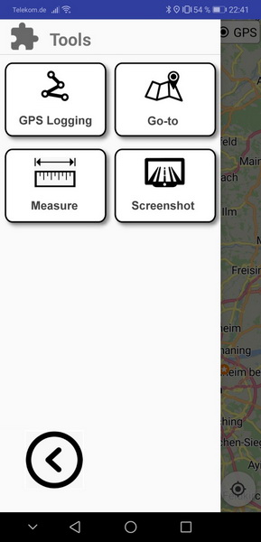
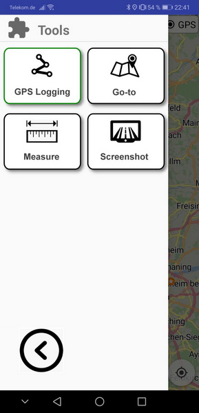
With such a UI system it would also be possible to better show the current state of those menu items which can be switched on/off (like “GPS Logging” and “Measure” in the “Tools” menu).
In the 1st picture GPS-logging is switched off, in the 2nd switched on:
That would be possible in current UI too, but Android doesn’t offer such native functionality, unless use buttons or check boxes, so most of the time developers must implement it themselves.
In fact I was just inspired by other apps where (according to my experience) the UI elements work quite well even when not tapping accurately or with gloves or “thick fingers”.
Examples:
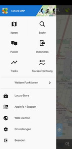
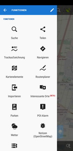
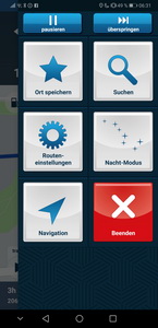
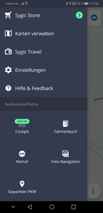
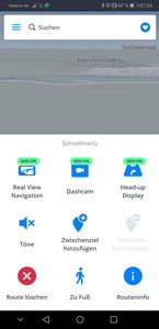
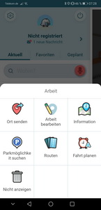
Locus
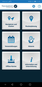
MyRoute-app Navigation
Sygic
Waze
I’m absolutely aware of this. I’m a (C++ native Win32 API) Windows delevoper and know the pain of creating custom UI without using frameworks or special libraries. But once the work is done it’s “your” UI framework and can be used for a long time without being dependent from platform’s changes.
I wouldn’t see a need to redesign the complete menu. From my point of view it is sufficient to just re-design the context menus (when long press on the map or using the blue arrow or the context menu when press on the top left navigation bar for skipping waypoint, auto-zoom and voice output), so all menus which are useful while driving on a bike.
Is this possible to re-design just these and leave the rest as it is?
Fact is that I was in the middle of nowhere wihtout a destination… maybe I pushed the delete route in the menu??? Since the texts and menu entries are too small, this can happen easily while driving. If the functions are not clearly operable with motorcycle gloves (also already mentioned in other topics), this results in the same effect.
If the routing methods are adapted in the next version, I hope this sorts out the biggest problems.
UI is normal sized with default values everywhere, like the operating system itself.
The relevant feature topic (here) mentions a larger UI, so that is the correct term.
Though with only 1 vote, it doesn’t seem much popular request and still remains at the bottom of the long features list.
Here the problem I don’t see at the app, but at the use of the app. Sometime it’s much better to stop driving and then managing the app.Then you can put off the gloves and managing the app is much more comfortable. And mismanaging of the app you can avoid.
Using a 4,7" screen (320 dpi) for me the size of text and menu entries is not to small. But to manage the menus and dialogs normally I don’t drive.
And sometimes this can help saving a bikers life. It’s already quite dangerous to operate simple functions (like tapping on the direction indicator arrow to do a rerouting) while driving but switching those menus is absolutely reckless. Don’t fiddle around with your smartphone while driving!
If you want to stop driving and then play around your device, do it. f you want to drive back to your starting point after justing having started your round trip, do it. Maybe this works if you are alone on the route.
I don’t want that… I want to use simple functions with motorcycle gloves while driving without the possibility to use wrong menu entries because they are hidden in several submenues not readable without a magnifying glass. I have my smartphone directly in the visual field behind the wind screen and can use it in parallel while driving without any danger… BUT this works only if the context menu entries are unique and big enough in text and touch area size. I don’t need big menus all the time on the screen, this was counterproductive. I am talking of context menus, for example when pushing the blue arrow or wiping to the left or right (like in navigon cruiser app, just to tell an example).
As already told, I mostly am the road captain with several biker colleagues following and when I permanently have to stop because the navigation app is behaving strange, then I can probably drive alone on the next tour because no one want to follow me any more or I can use another app.
Sorry to heat up the thread, but maybe a simple (?) Interface size multiplier would be enough? Everyone for whom the standard Android setting is sufficient would leave x1.
I, over fifty years old, only wear glasses for reading, but I don’t need them to drive. That’s why only in Kurviger I automatically change the font size from ‘No. 2’ to ‘5’ (on a 7-point scale), and after quitting Kurviger, size 2 returns. Glory to Tasker!
Font size options should already exist in official Android display settings.
If defaults are not enough in app, then cannot be usable for rest OS too.
Something internal in app would require substantial changes everywhere, maintenance
and tests to see how changing size affects app UI elements in all mobile screens & dpi.