I think this is very well possible.
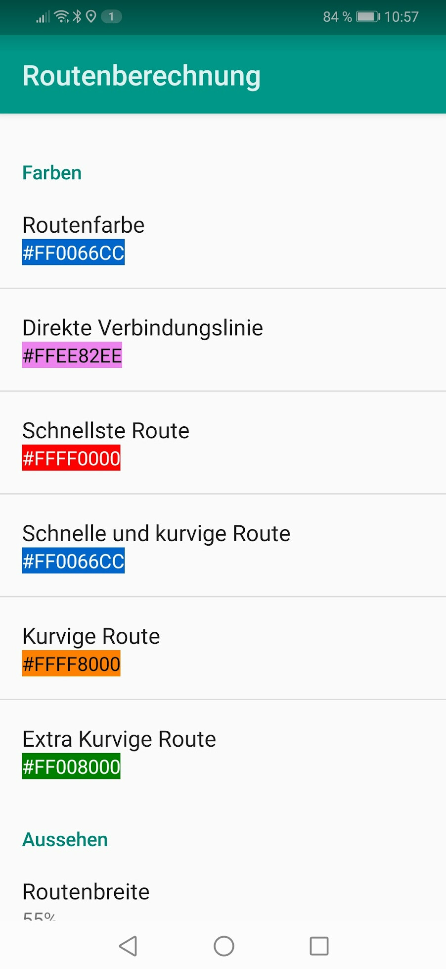
I have the same request to make more colour difference between the different route options

I moved this to a new topic. What would be your proposal? Do you have an idea on how to improve this?
Maybe like it is done in the APP? In kurviger Tourer there are symbols on each route segment, but I agree to Erwin that different colors would be more convenient.
I do not have the app because i have an iphone.
But yes, this color difference looks great.
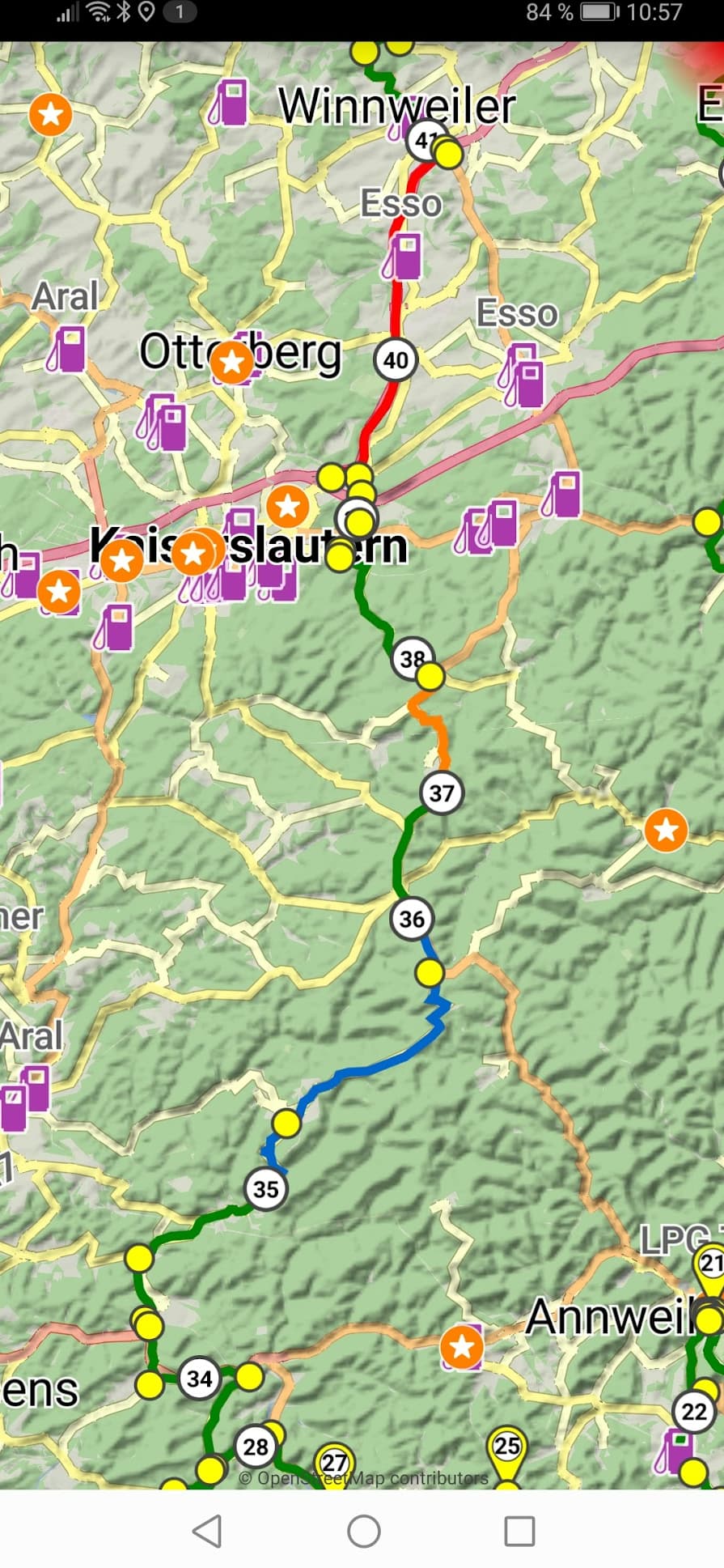
Garmin does it simular and makes the selected route the top layer so you only see the deviations from the selected route in a different color.
My compliments to the programm and the fast reaction. I use it every week to make a tour.
This is available on the website. Website: Colorer des segments du parcours entre des points de passage - #8 by boldtrn
I think the question is about using the “all 3 curvy routes”?
Yes about all 3 curvy roads.
The difference between blue , light blue and light blue is confusing.
Thanks for confirming.
So is your main concern that you would like to better see the current selected route or would like a better difference for the non selected routes?
One reason why we haven’t added color to the non selected alternatives is, that we use color on the selected route to show additional route information (like closed roads). So I think this is something worth to discuss about, but I would like to avoid adding too many colors to keep things simple ![]() .
.
1 Like
Yes, any other way to distinguish between the alternative routes is also ok.
Yes, i would like to see the difference better between the selected route and the alternatives
It looks like you have already changed it.
I now see red yellow and green routes.
Very good.
To be honest, this hasn’t been changed yet ![]() . But I am glad it is working fine for you
. But I am glad it is working fine for you ![]()
