Too late and the old UI was not really nice.
Or the stroke / shadow can be removed from everywhere in the map + app and make it 2-colors!
Too late and the old UI was not really nice.
Or the stroke / shadow can be removed from everywhere in the map + app and make it 2-colors!
Sorry, for not being amused…
The UI is optimized based on several factors.
You can use the default colors or invest some time to create some nice combination,
instead of complaining without even testing all possibilities:
also good, as long as you can set both colors equal
Well, actually I meant the stroke around the text.
I can live with that.
But I see no reason why the panel’s rectangle border is necessary.
Especially if you set the background to full transparency it looks a bit awkward.
No, even better is what most other apps offer:
One UI for everyone without options and whoever likes to use the application.
(with less maintenance for the developer)
Maybe for full transparency.
Though it is easier to see something quickly if it is positioned with separators.
Not me …
It seems to me much clearer and more readable in the previous option than the current one.
When you look at the phone on the sofa at home, the 2nd option with shading in the letters is beautiful, but when are riding the bike, the shading and the boxes around each field are disturbing.
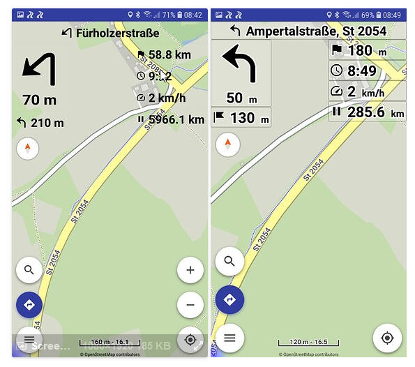
No, looking at the 2 images (except the borders)
the left image is not readable, while at the right with the shadows the text is clear.
Transparency absolutely needs stroke / shadow, this a fact.
You can always use a solid background for better contrast.
I have to completely disagree and obviously other user share my opinion. I have made my first ride with the new version. The shaddow and the fact that it is only white or black very much irritates me. It is not good readable at all especially not when the sun is shining directly on the display. Solid colors are then 10 times better readable.
If the shaddow color would be free configurable like many other color options, this would help a lot and suit the needs of all users. Those who don’t want to change it, can leave the default settings, all other can adapt the shaddow color according to their wishes including hiding the shaddow by setting the same color as the arrows or text elements.
What I find good in the new version is the speed limit including the tolerance values. I would propose to have 2 tolerance limits, one for inner-city and one for outside town.
The different configurable colors for different routing options are also very nice. Here it is also working to vary in detail. Why not with the shaddow? Even if it is difficult to develop, please see it as a challenge.
Not a third one for weekends? I wonder …
This is not a request concert! Please show me an app that offers you so many setting options, especially for the display, like Kurviger.
Most navigators have solid colors (it is also the default).
(see Google Maps)
Transparency requires shadows, all apps work like that.
So if anyone does not like transparency, use solid colors.
Sorry, the app is not a paint program.
Instead I’m thinking to start removing options…
this is a sarcastic, unhelpful post. My Wishlist was meant seriously. Not every wish can be fulfilled, but you can still express it.
What I have meant were solid colors for text elements (without white or black border). I think I have described it before. If not then I don’t explain well. I like transparency for the navigation bars (background color).
Not a good idea. I can’t know how difficult something is to implement. I only express wishes or suggestions. I don’t expect everything to be implemented right away. If something is not possible at all, it would be sufficient to explain pursuably why.
That you can change the display size is in any case also an improvement over the verison 1 Pro. Maybe I also have to play a bit more with the foreground and background settings as you mentioned. Sometimes it works better at the second glance. But all were just questions. Nothing to get upset about.
I think I know why the text is not so easy to read with shadow effect. It is due to astigmatism and/or presbyopia. With glasses, the transitions in the double-color black and white font (font with shadow) are easy to read and the font appears clear, i.e. younger people have no problem with it. But older motorcyclists like me have blatant problems when driving without glasses, because by the change of colors black and white and indeed no matter whether white on black or black on white the transitions blur and this is exactly what is so irritating. If at least the font would be monochrome, the problem does not exist. Therefore, I really ask you to make it possible to at least optionally eliminate the shadow in the font by assigning the same color and transparency to the font and to the shadow, so that the font in the navigation buttons appears in one color.
Please no comments why I drive without glasses. I can see far away very well, but not so well up close or mid distances (80 cm). Therefore, I don’t necessarily need glasses for motorcycling. However, the smartphone is in the near or screen area and therefore I can no longer see sharply without glasses. A monochrome font, on the other hand, doesn’t generate this problem.
You can continue to make fun of it for all I care, but for me it’s a serious problem.
Thanks for your understanding.
Then do not use transparent UI. Use solid color background.
Keep the default setting: black on white (or invert it to white on black).
Transparency requires shadows, like exist already in all map.
Isn’t Google Maps perfectly readable with solid colors? It has billions of users!
I can remove all color options from everywhere in the app and use similar solid colors.
Unfortunately I don’t like this because it takes too much away from the map. Due to my age I need to set up a big font size and this results in too big navigation bars. I like the transparency, because only the text is then big and as much as possible is visible from the map. I just tell it as I feel it. You don’t need to do something if you don’t want. I’m just describing how it looks to me and why I like the transparency. I don’t say the the new UI is not nice looking for many users. In version 1 Pro it was just perfect to me.
I respect you opinion.
However discussing the same thing constantly… It is annoying for all forum users who see new posts
and new mail notifications about the same thing again and again. And it really does not solve anything.
It seems that Kurviger to be so much user friendly with so many options was a bad idea.
Google Maps with minimal options and forced defaults knows better to build a perfect UI.
So a new strategy may be needed in the future. I will think about that…
As already mentioned far too many times, the new UI is better because it follows basic paint principles.
So it can only be improved but only where it is possible…
You have to either get used to it or use different colors.
I guess I will get used to it.
Absolutely not. I use Kurviger because it is that configurable and user friendly. For this reason, I am even happy to forego current traffic conditions and look for a detour in the event of a closure.
To deviate from this again would be, in my view, a wrong move.
Google Maps is boring. I never use it on the bike. I only use it in the car because of Android Auto or Apple Car Play and because planned routes are not important to me there.
I hope you don’t want to make Kurviger as boring and interchangeable as other apps. Because currently it has significant unique selling points. It is still the best motorcycling app when the way is the goal and you like diversity. I hope this will stay.
Give him an inch and he will take a mile.
I also think we should concentrate on the important improvements in the future.
Such color gimmicks are nice to have but at least I personally don’t really need them right now. As long as the app just runs well and brings me curvy to destination I’m happy.
no problem if someone shares his opinion about shaddow coloring option, but this is just another unqualified sarcastic and unnecessary remark