If you like it, we can use version #3.
Or do nothing and if you find better - simple, not emoji - characters in the unicode table,
we can try them.
If you like it, we can use version #3.
Or do nothing and if you find better - simple, not emoji - characters in the unicode table,
we can try them.
I think Unicode might be better than emoji (?).
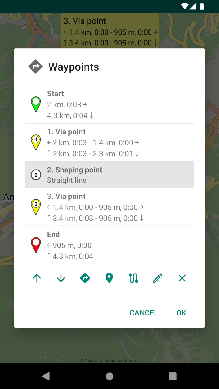
Maybe these arrows can be used as start/end: ⤒ ⤓
And ordinary ones as the next/previous via point: ← →
That’s correct, the “simple” unicode characters are better supported.
Sorry Emux, but the problem in searching the aforementioned table for a proposal is that I really don’t know what is a simple character or a more complex unicode character. This makes it almost impossible to come up with a good proposal from that large list. In the end, they are all unicode characters, right?
What I indeed notice is that some browsers (pc chrome) do not present all characters. Firefox (pc) does it pretty well. And on Android the support seems to be even better.
Anyway in your own image proposals the example # 3 looks fine.
On the contrary - as apps are not browsers - on Android / Java the support is worse.
Also there is an additional restriction:
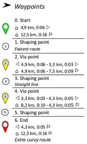
The text width of the “start” and “previous via point” characters must be the same,
so the beginning of the texts appears in straight line like in the above images. 
See the below arrows (the ▲ and ◀ have same text width):
Ah, that is useful information. Exactly the same broad characters! Limits the universal search.
No colour circles so only the simple triangles and flag of the same width indeed do so remain.
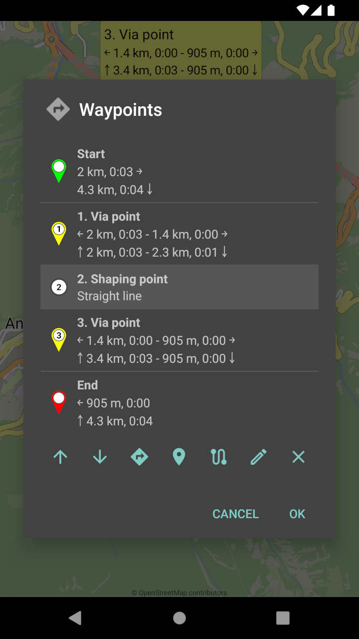
Filled icons visually load the view, getting the focus from the other text.
(especially on a white background)
Version #4 seems easier to read on the eyes (list and bubbles).
In any case, if there is no agreement on the icons, let’s leave it as it is now.
(also avoiding possible incompatibilities)
Emux.
You alone have the real product before you.
I trust you to make the best selection.
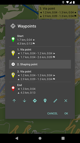
My sample image has already been modified.
One difference is that there is also a start flag.
From the start thus with tight text alignment.
You choose.
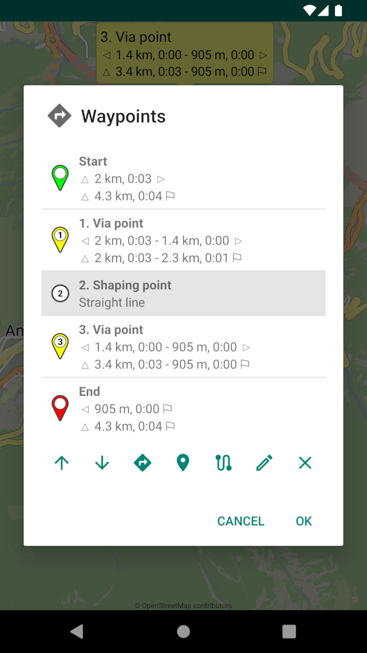
Until now there is discussed about possible displays of the icons.
This may be a reason to add the icons at distance /time.
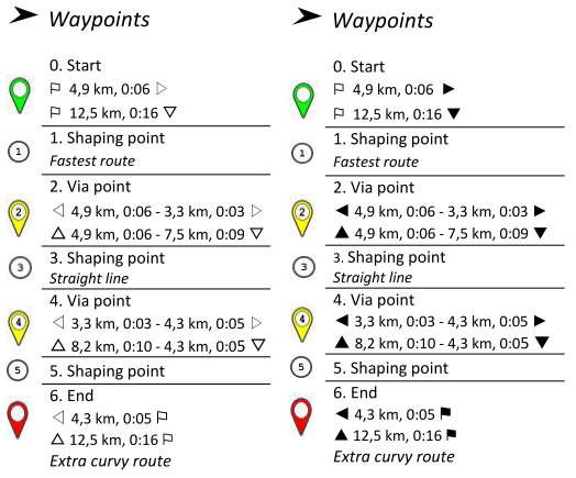
Here a modification of the proposal of @0709:
That’s very similar to Version #4 of @devemux86. End icon (flag), Previous icon (arrow to the left), Next icon (arrow to the right) are the same as in Version #4.
In the modified picture the size of the icons perhaps differ to the size in the app. But it’s ok like it is in the Version #4.
Difference to Version #4 is:
U+2302) as proposed by @linux-user. (This may help to assign the icon to Start more than the Triangle icon. Mainly for the users of the Kurviger website. I assume that most users of the Kurviger App is using the Kurviger website, too. This House icon seems to have the same width than the Triangle icon.)This may be the main reason not to add the icons at distance / time.
So far my contribution to the discussion. devemux86 ultimately decides whether and how the icons are added.
They have different widths, so we cannot use them together,
in order for the texts to be left aligned.
And we do not know how they appear on different devices.
The ↗ ↘ appear on some devices with background!
I also prefer #3
Thanks for the clarification. Then the triangle icon is the better solution.
Both are fine. But especially if you work with a black background as in the previous examples, a filled icon is clearer. So I still prefer 2. If it is decided differently, that is no problem for me.
I still do not see how random icons can help.
More seems to load and complicate the list.
I also like the second option better
Independent (female) advice was called in, saying that this is part of the planning.
Advice says: This is also nice and clear.
Like Firefox’s toolbar with outlined, not filled icons, clear appearance in light and dark themes.